On 13 December Galerie 180 will open the new exhibition ‘Demophobia’ with works of the Ukrainian artist duo Synchrodogs and Dutch photographer Isolde Woudstra .
Both the work of Synchrodogs as that of Isolde Woudstra is about the loner, the dreamer, about identity and body language. The relation between the person being portrayed and its surroundings play an important role in the images of these photographers. Synchrodogs focuses on the extravert, while Woudstra’s focus is more on the introvert side. Their pictures share a mysterious and sometimes ominous aesthetics, and invite the viewer through surrealistic suggestions to submerge oneself in a dream state.
Synchrodogs
Synchrodogs originate from Ukraine, where in 2008 Tania Shcheglova (1989) and Roman Noven (1984) fell in love and started working together in the fields of art and fashion photography, blurring the boundaries between the two. Their work includes collaborations with Neon magazine, Urban Outfitters, Vice and Harpers' Bazaar Ukraine. In 2011 they won the Harpers' Bazaar art photography award. With their quirky vision, the artist duo Synchrodogs realizes ideas and fantasies inspired by the ever-changing ambience of their environment. Tania Shcheglova and Roman Noven mainly use themselves as a showcase for their studies, deconstructing personality and producing images that dig deep into the core of human nature itself. Their main interest lies in bringing primitive instincts out of a viewer, allowing one to embrace their natural beauty, encouraging one to be free from any predispositions and fear of being misperceived.
www.synchrodogs.com
Isolde Woudstra
Spoon bending daily-life with her images, and with the constant appearance of her editorial work in several magazines, Isolde Woudstra shines through the latent relatable darkness of her autonomous vision. Her work is posited on the interface of reality and dream-world, while always maintaining its functionality and clarity. The images of her slightly sinister world are raw and natural but cause confusion at the same time. Woudstra graduated from the Utrecht Schoolof theArts in 2007, after which she started working for a variety of magazines while continuously pursuing her personal work. Her work was published in magazines as Dazed & Confused, Vice, Glamcult and the Word, and exhibited at Unseen Photo Fair, Foam and Nova Cultura Contemporanea.
‘Demophobia’ – Isolde Woudstra & Synchrodogs – 13 December 2012 until 25 January 2013
Opening: Thursday 13 December, 8.00 PM
Artist talk: 17 January 2013, 8.30 PM
Address: Voorstraat 180, 3311 ES Dordrecht, The Netherlands
Info: T. 0031-78-631 89 13
Website: www.sbk.nl of www.sbkgalerie.nl/galerie180
the
180mag
editor's blog
"Anyone who listens to an artist needs their eyes examined" -Claus Oldenburg
"Anyone who listens to an artist needs their eyes examined" -Claus Oldenburg
send us an email
You can track this page with Google reader, firefox add-on Update Scanner or others Click here for page
| current
issue submissions contact archive 180 studio 180 gallery |
Cool Links |
my
soundtrack: folkradio.co.uk Kim Taylor my other blog: Unka Kim's Bloggie Thingie my 2012 workshops: 180 photo workshops blog workshop articles (so you don't have to look through the last two years of blogs) |
blog
archive
|

PDF file, click here
Time to get working on the next issue of 180mag.ca and so it's also time to check out the net for the artists for the next issue. Having spent an hour or so moving through a few blogs and emailing a few photographers I returned to the mailbox to find a message from a photo site. Opened it up and it was all about the newest camera equipment. Yay, of course camera magazines and camera websites are all about the cameras, absolutely, so what can you ask? But wow did I delete that message fast. I just don't want to know about the latest iso achievement, or the latest megapixel boost or who's got... you know what, I was going to say who's got the biggest flash but it's not about accessories anymore is it?
Anyway, go look at some current photography, I mean in the galleries, in the art blogs, in the upscale fashion mags. It's not about the equipment because a photographer who is looking to extend the form is all about perverting the camera-ideal. It's about black and white not foveon sensors, it's about blur not in-camera vs in-lens shake reduction, it's about shadows not hdr (or as I like to call it, compressed light range).
Instagram filters have more to do with an avant garde style these days. Anything to avoid looking like the local garage glamour guys with five-light setups and the pore-invading, tack-sharp, 16-bit-colour image.
Back to black and white, to lens flare, to what it used to look like with a bit of grain, all in an effort to capture something that doesn't look like Barbie with baby-oil on. Which of course, means back to something that goes a bit beyond pretty to something that has a bit of emotion and that's nothing to do with the latest camera or the newest instagram filter. No amount of gadgetry can make up for a dead image, only the ability to get something out of the model, or the landscape, or the food for that matter. I think we've proved to ourselves that food shots might want to be left to the specialists.
Anyway, it's not as hard as you might think to go through a million photography sites and come up with 10 artists you want to publish. On the other hand, it's a given that each month I have some trouble with some of those same photographers. It seems simple to me but... put your email address somewhere easily found! Somewhere that I don't have to jump through hoops to get in touch. Flickr Tumblr or any other dooflr place where I have to sign in to send a note is not going to get you an invite to 180, let alone a paying gig. First rule of commerce, folks gotta be able to get in touch. Second is they gotta know you're out there which, if you think about it, might just be related to the first.
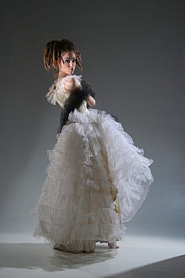
Hey, one of the old photo sharing sites just showed up again, if anyone wants to check out some of my work from ten years ago it's at http://www.imageopolis.com/photographer.asp?id=15642#.UuJx3rROlhE
So What Can We Shoot
I see that yet again there is a big kerfuffle about photoshopping. This time it's an underwear model for goodness sake, who posted a photo she grabbed off the net. Seems someone photoshopped her waist a bit thinner than her post-baby size actually is.
I had to look for five minutes before I spotted it. That of course proves that I'm not very critical when I look at bodies, which might seem a bit strange if you assume that my nude work is done because I want to look at perfect bodies. It isn't and I don't, it's about light and play, but never mind. I was impressed that people could get worked up over the photoshopping of a model. She's a model folks, of course there's photoshopping!
There is another "dove video" making the rounds. You take an ordinary person and do the photoshop makeover to create a perfect image. The problem with those things is that you get an ordinary person and you work very hard and expensively to create something that is already there. An "impossible standard of beauty" that isn't impossible at all. These beauties exist folks, walk into any high level model agency and you'll find them. Does anyone really think that a photographer would spend 50 hours on a single image when they can call an agency and shoot that image in ten minutes? There isn't that much money in the photography world any more, hire the best level of model you can afford, then spend the minimum time at the computer to create the image you need. It's all a monetary balancing act for the low budgets, but with the big ad jobs, you can just hire the ideal you want.
Yes, those professional models are the top 1% of lookers in the world, but there's 6 billion of us. The impossible standard is out there walking around, I know a couple or six of them in Guelph. Don't need massive photoshop to make them what they are, but of course even at this level there's photoshopping going on, 16 year olds have zits, so do 30 year olds. The flawless skin starts to show some wear around 25, we deal with it. Oh? We aren't supposed to cover up the zits? Fill in the wrinkles? Can we do it with the makeup artists we hire to do that? OK you stop buying makeup yes?
Way before the "healing brush" that took lines out of the face we had softboxes on the lights. (One of my favourite questions is "how do I get a nice sharp shadow with the softbox?" The answer is of course to crank the output on the light to it's maximum and pull it away from the model about a hundred feet). Before that we had umbrellas, and back when we used fresnel spots (a really hard light for those not old enough to have ever seen one) we had diffusion filters on the lenses and wide open apertures. We had scalpels to scrape negatives, and pencils and dodge-and-burn tools, real ones for when we printed pictures on paper.
In other words, photographs have always been 'shopped, always. From the very first images ever made the photographer has tried to make their subjects look their best, better than their best. Slow exposure times? How about the dishonesty of head clamps to keep people
from moving during a 30 second exposure? That's OK? But it's not what would actually be seen in that situation, people twitch, you should be seeing a blur for a face. Tripods? OK for an 8 by 10 with glass plates that's too heavy to hand hold, but once you get to the Box Brownie you should never use a tripod to create an artificial stability for that extra sharpness in a landscape should you?
So please, all those who worry that the photoshopped ideal images of unrealistic beauty are causing you to become phsychologically damaged because you figure you're too fat... and those who believe that of others since of course you are perfectly self-empowered and uninfluenced by advertising imagery but... Please, tell us poor photographers just what we can use. Tell us what equipment, what techniques, what lighting and editing we are allowed to use to take a photo of a model.
Once we have that information we can start figuring out ways to make better looking photos using those rules, and more importantly, we can start saving up to hire even better looking models (whose salaries will skyrocket).
You see, the guys with the best looking images will still "win", the images will still get made. Photoshopping toward an ideal doesn't really do anything except make more models available, and drag down the pay rates for all of them. It certainly didn't make you any more self-conscious than you are now. When the ideal was Marilyn Monroe young girls craved big sweaters, now they want a gap in their thighs when their knees are touching.
Since we're speaking stereotype, you all know that husbands don't notice new haircuts on their wives right? Then just who notices that 'shopped waist on a supermodel between two other supermodels? If the common knowledge is correct, us guys haven't got any lower than their boobies by the time the real noticers are starting the tweeting chain that some journalist sees and reports. Then us guys go back after we're told there's a problem and we're given the before and after and we spend four and a half minutes getting past the boobies again we may notice the slightly thinner waist.
Photos lie, all of them. You know this.
Photo Blogs: Just Say No
I'm sitting here in the Photo Arts Club office at the University of Guelph doing my office hour. The club is probably the last publicly available darkroom in Southern Ontario, certainly one of the few. I was first here in the 1970s where I'd spend three or four days a month in one of the two darkrooms developing film and printing my month's work. Now I am here for the studio, but I still love the darkrooms and watching the students come out with their treasures.
But right now I'm sitting in front of the computer going through some blogs because I figure I should keep up with the field.
Stop reading this now.
Go take pictures.
I need to stop reading the blogs, my desire to take pictures is leaking out of my ears as post after post of "what it is to be a photographer" and "fun photo based jewlery" and "don't be a guy with a camera" force their way in through my eyes.
If I'm not reading I'm looking at images.... thousands and thousands of images taken with camera phones and put through digital filters so that it ALL LOOKS THE SAME. Listen, in "my day" it all looked the same, I grant you, but there just wasn't this enormous mountain of it.
I love digital imaging, I take an average 600 shots in a single studio shoot, but you'll never see 590 of them, and I don't want you to. In fact for many of those shoots you won't ever see an image. It's called editing, I suppose it's kind of like not saying the first thing that comes into your head, something that doesn't seem to happen in the age of twitter and flickr.
Why do all these social networks sound like some sort of sexual innuendo?
I think I'm happiest when I'm not checking out the modern aesthetic and reading the blogs... I know I'm happiest then. I get the urge to go make photographs.
Talk about it or do it. There's the traditional decision.
On the way to the cabin I listened to an interview with a photographer who took portraits of families and the subject of privacy came up. It was assumed that taking a photograph was a revelation somehow of the private lives of those photographed.
How do we come to this idea? If the photographer were to write a story and changed the names it would be fiction. She could write a quite specific story, but it would still not be considered an invasion of privacy, so why a photograph? Why is it that even without names in a caption a photograph is a problem?
Consider that recently a man was seen in a Toronto neighbourhood in a public space taking photographs of children. The occurance seemed to deserve a newspaper story and the reporter duly reported the folks in the area saying that they would "run him out of the neighbourhood". Really? For taking photographs in a public park? If he were writing a story there would be no story, but somehow again, we are seeing a photograph as something entirely different.
Is our image so private? Is it just that a photograph can be recognized, while a descriptive short story can be denied? If I write about your bad habits but leave out your name is this less of a problem than if I simply show the world your face (again without a name).
A leftover prejudice from a religious prohibition of graven images?
I have no conclusion to present here, I am simply wondering why it is that the image of your face, the thing you show the public every day, is somehow more deserving of privacy than a written description of your activities and interests. Personally, I would much rather you stick a camera in my face than a tape recorder.
Ran across yet another article in a photo magazine where the author pulled out the old observation: "That's a really nice picture, you must have a good camera". Of course as photographers we're offended and are encouraged to reply "This is a really nice cake, you must have a good oven".
Problem is, the oven helped, and so did the camera.... a lot. Try to take a poorly exposed, badly focused shot with a modern digital slr. Really? Did you have it in manual? I've got several digital cameras around, seem to accumulate them, and not one of them takes a bad shot especially when you compare them to my first rangefinder with its busted aperture and its out of adjustment light meter. I needed some serious technical chops to expose that thing, and some skill in the darkroom to compensate when I blew it.
When you had to cook with a wood fired oven you had to be a good kitchen technician, and when you had a film camera with manual controls and a light meter in your back pocket you had to be a good photographic technician and that was worth paying for. Not any more. A while back I did a photo workshop for a bunch of scientific types who needed to record information on the farms they visited. Half way through an explanation of the relationship between aperture, time and iso I realized I should be saying just one thing. Set it to auto and make sure the autofocus is on, that's the autofocus there and that's the auto setting. Oh, and put the sun over your shoulder.
It IS the camera if you're talking about a nicely exposed and tacksharp image. An image from an slr compared to a point and shoot might look different but not all that much, they're both going to blow away your old film camera. However, if you're talking about a commercial job you may have to worry about being able to deliver a raw 18 mp file to your employer. In that case it is still the camera that makes the sale since the point and shoot isn't likely going to give you a raw file. It could I suspect, if the company wanted to enable it, but it won't.
If you're going to do weddings and you want to get paid, you'd better be doing a better job than Uncle Leo with his digital slr. Good luck if all you've got is a more expensive camera that uses the same sensor, because you're not going to beat him on the quality of your exposure or your focus. You've both got great tools and the bride's mom isn't going to want to pay you for the same shot Leo just took.
You have to compete on conception, composition and control of the wedding party. Your shots have to look like they were taken by someone other than Uncle Leo, they have to be creative not "street" (Leo is doing street), they have to be composed (Leo probably doesn't know about the rule of thirds... then again maybe he does since his camera will give him a thirds grid) and mostly they have to be controlled. You can yell "everyone look at me", but then again, so can Leo, but you get to take the wedding party to the special location you've scouted for the official shots. Hopefully you won't have to wait too long for the other wedding parties to clear out of the old ruined mill...
Well, try your best, you've all got the same tools and they are amazing. It takes so much work to take a bad shot with your good camera that there's a whole industry out there for digital filters that make good files look bad, and a whole social media network for those shots. In fact, there's a market for leaky plastic cameras and film... hmm
Maybe I'll dig up a 4x5 camera and a big-assed tripod, in fact, maybe I'll see if I can find a magnesium flash pan! Now that would be a wedding shoot worth paying for.
I suggest that we tell all the budding photographers out there to take a few art classes, maybe an art history too, rather than that photoshop course they figure will make them a mint. You can bet Unkle Leo has the latest version on his laptop and I even bet he paid for it.
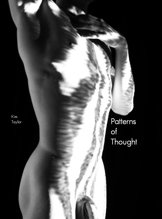
I have been messing around making ebooks lately and as a learning exercise I have put together Patterns of Thought with some of my coffee shop poetry and projector pattern images. These shots were done with "sneaky photographer" the little Pentax point and shoot that I set to take shots every 20 seconds while I'm working.
Enjoy, let me know what you think of it, and how it works in your reader.
e-books/patterns-of-thought.zip
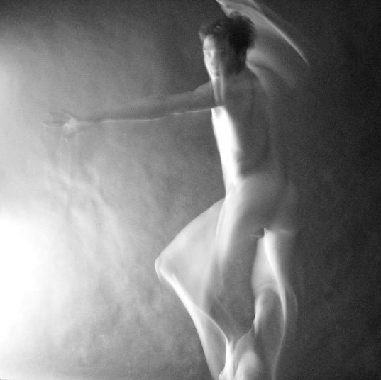
Chance favours the prepared, and I often set up a the point and shoot in the studio while I'm working. It takes a shot of whatever it can every 20 seconds and looking at it later is just like looking at a roll of film just back from being developed at the drugstore.
As I write that I just remembered that my Grandmother worked as a film developer in the local drugstore when she was young, that would be the 1930s or 40s I suppose.
This shot is from yesterday, it's a crop but nothing else was done, the settings ended up as 800iso, 1/4s and f3.25. I put the camera on pan focus and auto and let it go. I'm not entirely sure now that I think about it that this shot would happen on a film slr, just from the way the shutter moves across the film plane, as vs. the sensor being entirely exposed for 1/4 second... Something to think about, but I really like the liquid light quality of this shot.
If you check out the 180mag text you'll find that most of the artists featured each month will advise new photographers to shoot often. It is a good idea to set things up for yourself in a way that you are more likely to shoot more often. This means having a reason to snap that shutter.
Can't figure out what to shoot, work on one of your projects. If you don't have one at the moment, I'll give you this one, it's called Rolling White Balance. First, check to make sure your camera has a custom white balance, then figure out how to use it. Now go shoot something, make a nice shot. Pick a solid-colour part of that subject and set your white balance on that. Now go shoot something else, then set your white balance on a colour in that shot. Keep shooting and setting.
Here's a quickie sample from last weekend's wandering around a tourist town in winter.
 |
 |
 |
 |
 |
 |
 |
 |
 |
 |
 |
 |
 |
 |
 |
 |
If you never get a decent shot you'll at least get an idea of what the white balance is doing.
I love this stuff
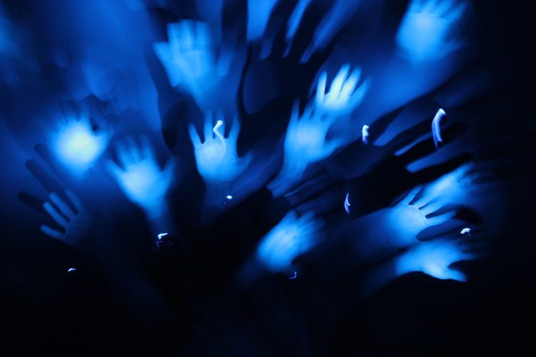
iso400
f8
25sec
and a single LED bulb
I'm a photographer, so I look at photo magazine articles but every so often I'm startled into thinking about what I'm reading. I was part way into yet another item on how to get the most out of your SLR... you know the type:
- Turn the dial to manual
- Turn off the auto-exposure
- Turn off the auto-white balance
- Turn off the... well this one said keep the autofocus on.
- Shoot in Raw
I'm sorry, I spent the '60s with my spotmatic II wishing for auto focus and auto exposure and a motor drive and unlimited numbers of shots with no chemical stains or stench and all the other wonderful stuff we've got now so that I didn't have to spend all my time futzing around with the mechanics of taking a photo.
Of course I shoot manual, of course I mess around with the white balance and all the other settings, but not out of an automatic desire to mess around with the equipment. I'm not in love with the equipment, I mess around because I want a certain result and I've figured out how to get it. Most of the time I'm as automatic as I can get because I want to be looking at the subject and not the camera. As for shooting raw and processing the images myself later... no thanks I've got a couple of nice darkrooms available to me at the studio so I'll spend time with real paper and silver if I want to have fun developing prints.
What I'm saying is that most writers of articles in photo magazines are interested in the camera. Most photo magazines are interested in cameras because camera ads pay the bills. Fine art photographers are lousy sources of ad income.
It's a scale with two ends, those who want to make images and want the equipment to get the hell out of the way and those who are fascinated with the latest megapixel counts and sharpness ratings.
I shot HP5 on a wide open 1.4 lens because I didn't want to mess with lights and I never repaired a meter that overexposed every roll because I liked the washed out look. What can I say? I was always more interested in the big picture than the size of the grain.
I was never a silver peeper.
So, 1212 is over in a few hours and the new issue of 180 is online as 1301. If I live to be around 150 I'll be able to do 0101 I suppose, won't count on it though. It's not all that interesting this matching month and year sort of stuff, it's what some folks call the "tyrrany of small numbers". Strangeness happens when you've got few items to mix and match with each other, patterns seem to appear but it's really not meaningful in any important way.
But thinking about that next 0101, I also think about my models and the many many interviews I have with them asking if they mind their face on the net, or the effects of appearing nude on their possible future careers.
I find it rather sad that I have to mention that because the next time it's 1212 nobody will care at all whose nude body showed up on the net a hundred years ago, and if that's so, what's the big fuss now?
Yet fuss there is, and will continue to be. Praise be to all the Bluestockings who still believe in original sin. As for me, I'm hoping that as we get toward the 2020s it gets more like the 1920s.
Chance favours the prepared camera or some such thing. I just found this shot from "sneaky photographer" as one of my models calls him, my Pentax W30 set to record a shot every 20 seconds. I just set it and forget it during my sessions and then look at what it finds afterward.
For my style of photography the damned thing is as good as me most of the time at finding unexpected movements and unguarded, unposed moments.
This time it caught my camera at work.
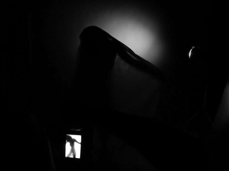
Fun.
or The Point and Shoot Rides Again
I mentioned that I had lost my point and shoot camera to the waves of Lake Huron. Well it seems that whining works as some of my martial art students got together and found me another camera of the same model on the net.
I took the camera along with me to Uraguay last month and even managed to do a photo shoot between teaching and judging.
Thanks guys, it was appreciated, and the next couple of stories from me in 180mag.ca will be from Uraguay using my third Canon A590.
Using the Point and Shoot
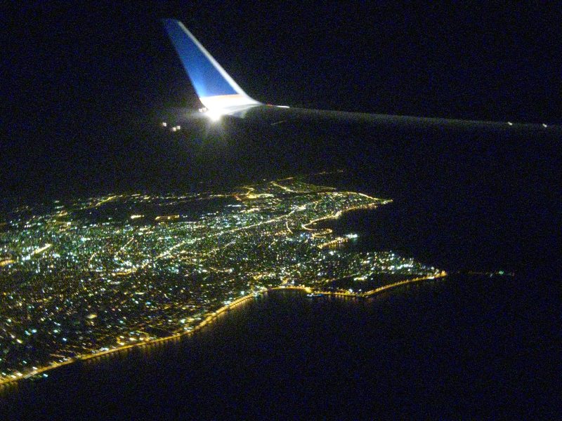
Montevideo on the flight in, Manual exposure got this shot at 1600iso. Automatic modes were frustrating, if not entirely useless. Hey, just like an instamatic wingtip shot!
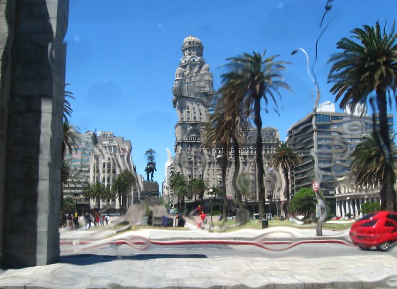
Old Montevideo from a new perspective, shot through the bubbled plastic over the van window. Wish I'd looked at the shot and done more of these but I have to admit I totally missed the effect, found it when I returned home. Still, a classic tourist view done in a new way.
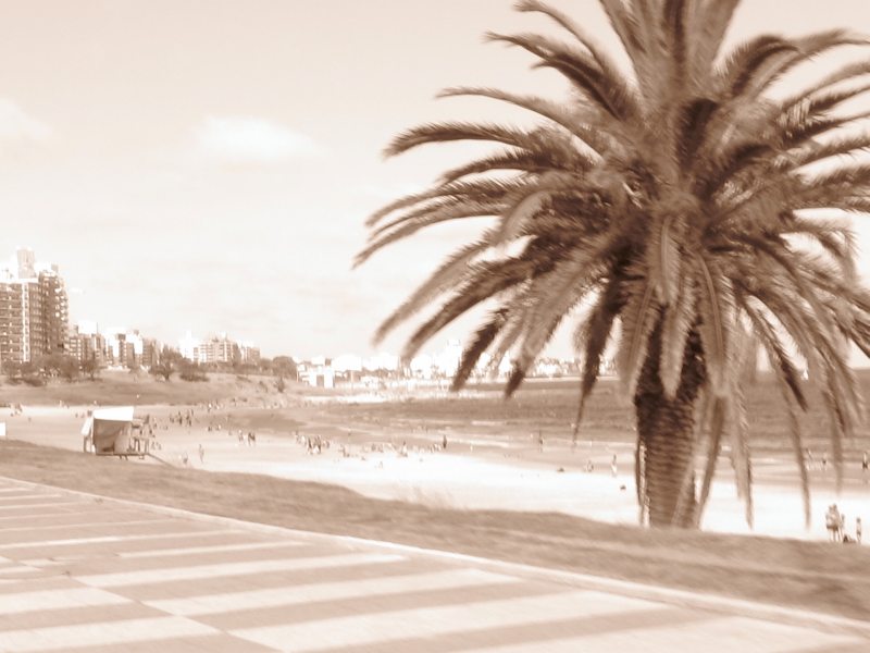
By the fourth or fifth day the tourist shots are out of the system and the artist should be coming alive. My impressions of Montevideo from my youth were a sort of sepia-coloured albumin print world from my Grandmother's travel books. On the camera is a sepia filter, combine with an overexposure through the EV adjustment and stick your arm out the van window as you drive from dojo to hotel.
A Quiet Riot from Willem Vleugels on Vimeo.
Exhibition 'Demophobia' - Synchrodogs & Isolde Woudstra (13 Dec) 2
My name is Karen Zhu and I´m reaching you from the independent publishing house SAUNA, a fresh and independent project currently linking editors, curators and artists living and working in Berlin, Frankfurt, Porto, Barcelona and New York.
I would be delighted to invite you to visit SAUNA´s website, introduce you to the project and let you know all about our releases and projects. We just launched SAUNA W/ Magazine with the first issue fully dedicated to the fashion photographer César Segarra. I would be pleased to let you know all about SAUNA and this release and in case you find it interesting to consider, we would be more than glad to contribute and be featured on 180degree Blog.
http://www.thisissauna.com/releases
http://www.thisissauna.com/sauna-w-is-out-now
All the best,
Karen
--
S A U N A
www.thisissauna.com
vimeo.com/thisissauna
info@thisissauna.com
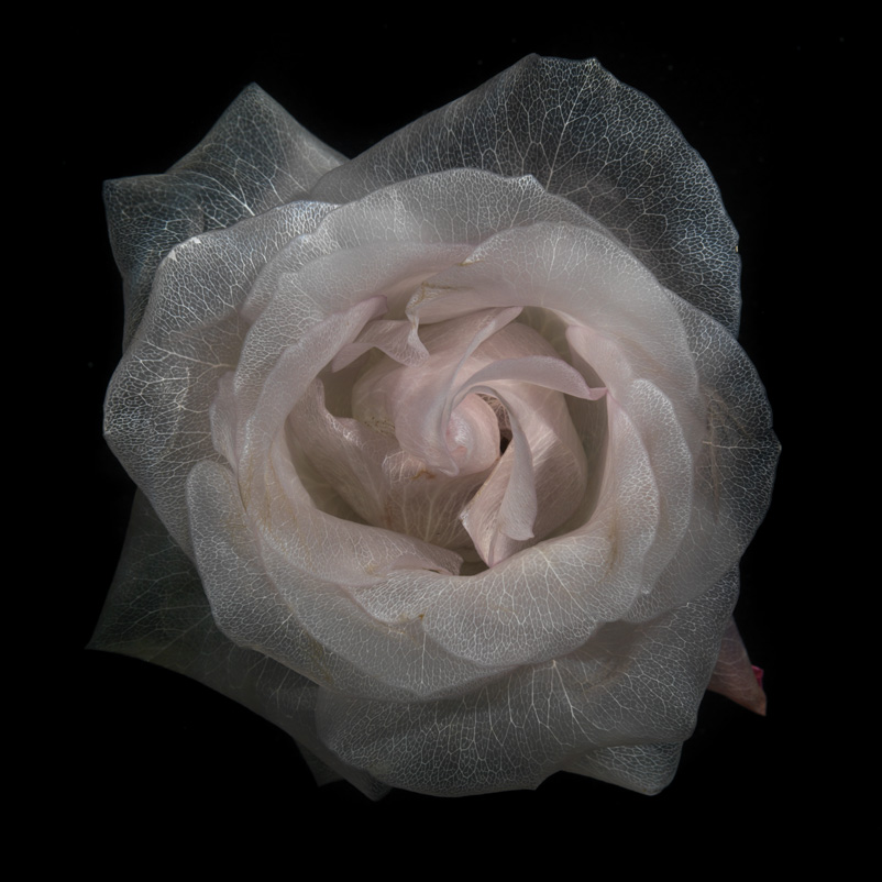
It has been an exciting start to the week as the first pieces from 'Glass' arrive in the studio. In this new body of work Alexander James has developed a process that naturally removes all the pigment from the capillaries in rose petals. It is a complex process that over time replaces the pigment with highly purified water leaving behind only the skeletal fibre and plant structure visible; all while the plant still lives and grows. These beautifully detailed and painterly photographic works are captured underwater and presented 'as shot' without the use of post production either traditional or digital.
© 2000-2012 Distil Ennui Studio
What if you were asked to write a book titled "An Introduction to Photography". What would you write?
Your chapters might include a history of photography but that would really be a history of the technological developments. To write a history of the uses of photography would be an exercise in frustration, photography was used for "everything" as soon as it was invented.
So a history of the technology. Start with... what, the image? The lens? The chemistry? OK let's not get into the camera obscura stuff, instead let's define photography as the creation of a... not permanent, a persistant image on a medium through the use of light, lens and chemistry... no that doesn't work for digital. Light, lens and information storage medium. Of course that lets out photograms (put leaves on sensitized paper or on a scanner). Image by light and storage medium... damn no that is still a problem for digital since there's no image on a hard drive, only information that can be used to create an image.
The creation of a persistant latent or actual image using light and a storage medium. There, now start with Wedgewood or Bayard or Niepce or Daguerre or Talbot as you wish.
So as soon as we had these technologies we had landscape and nude and travel and documentary and portrait as quick as someone could get equipment and subject together. Maybe after the technology we should split the book into chapters on the uses of photography.
Wow. That's like making a book on the uses of drawing, or painting or writing.
See that's the thing, photography isn't an object, it's a process, it's a medium of communication and so we now have to explain Marshall McLuhan's hot and cold media and medium as message... although that's a bit finely divided for an introduction so we can put off trying to explain McLuhan a while longer.
We could look at various media to see where photography is similar and different. Media defined as communication between people includes writing, speach, and paintings of bison on cave walls. Information exchange between environment and us expands a bit into all the five senses, but I know of no particular information exchange between people using taste, touch or smell. At least nothing very sophisticated since a punch on the nose could be said to be communication of a sort, and the exchange of bodily fluids containing genetic material is certainly an information transfer, but it's a bit beyond our book on photography.
What is photography most like? Painting I would suspect, and we can use the mechanical production of the image as our difference between the two. We won't argue about splitting the two since we were asked to write about photography not visual imagery yes?
What's photography least like? Writing I would suggest, with speach somewhere closer to writing than to visual imagery. A visual image is subject to interpretation. If it wasn't we wouldn't have all these critics and professors writing books on how to read a photograph or a painting. Writing? Speach? not so easy to interpret. See that doesn't even sound right, we would usually say misinterpret if we talk about speach or writing. Further proof of the assumed exactness of writing might be our common frustration with English teachers who insist we interpret short stories or poetry their way. We resist that much more than we resist the art teacher telling us the cave paintings in Spain are appeals to the Gods. They were done 40,000 years ago, how do we know that? They might be directions to the nearest McDonald's equivalent for all we know. It's this very ambivalence that allows us to accept the different interpretation with ease. Prof says Gods, we put down Gods and pass the course, but I'm damned if I'm going to believe that Leonard Cohen's Susanne was a princess!
Mesopotamian writing is about keeping track of the goats, we're pretty sure about that, and when the Egyptians wrote about the gods on the pyramid walls, we're pretty sure that's what they were writing about, so our 5000 year experiment with writing seems to be more accurate than our 40,000 year experiment with imagery and I rest my case. A photograph needs a caption if we want to be sure folks get the same message we intend when we shoot it. Otherwise we have to be satisfied if we can communicate general feelings and emotions. Accuracy isn't a given.
So now we may have a way to get at our introduction to photography. We find the structure by looking at the other media that have been written about and use that template. We go to a book that is an introduction to painting. Or an introduction to speach or an introduction to writing.
Oh...
You write it.
Bonjour à tous !
J'ai l'immense plaisir de vous
présenter mon premier livre "Rêvalités",
édité dans la collection "Voir
naître le talent" aux éditions KnowWare,
qui rassemble soixante-trois
photographies accompagnées de textes (français/anglais) !
Il est dès à présent disponible
en pré-commande au lien ci-dessous, et sera en librairie à partir du 14
novembre !
Très belle soirée,
Julie
___________________
Dear all,
I'm thrilled to introduce my
very first book "Dreamalities",
which is edited by
KnowWare,
and composed of 63 pictures and
texts (written in English and French)!
You can already order a copy
online (link below)!
Have a beautiful day,
Julie
Juliedewaroquier.com • Facebook

 I'm in mourning. I lost my
beloved point and shoot to a Lake Huron wave. Not just any point and
shoot, this was a Canon A590, the second that I've owned, the first
being the one I took to Japan and left there with one of my instructors
because he liked it. I found a second camera in a discount department
store and was happy to have it. The best damned point and shoot camera
Canon ever made and one they or someone else should remake!
 This camera had an 8mp sensor (two more than are needed, work on light gathering rather than resolution people! Go for big sensors and low MP counts rather than just buying megapixels. How many of you display your shots at 24 by 36 inches on your hallway walls?)
The thing had full manual control, a decently slow shutter speed (could have used a bulb setting), an optical viewfinder, a really cool digital/optical lens multiplier thingie that I don't understand but seemed to boost the range without cropping. Look, it had most of the fun things I wanted, including the most important, a ring you could take off and install an adapter that allowed me to put a fisheye lens that screwed onto the filter ring.
Sure it was plastic, sure it turned out not to be very weather-sealed, but it went to Europe and back with my daughter and I didn't mind if it got scratched up in my bag. I carried it everywhere, so I want somebody to make this camera again, with the following extra demands... and don't tell me to buy a G15, I want a $150 camera not a point and shoot that costs what my SLR costs. As for the modern versions of the A-line from Canon, they have done nothing but take functions away, no manual control, no optical finder... I really hate it when I'm looking around for a used camera because the "new and improved" ones are less than the old ones.
My ideal point and shoot:
- 6 megapixel, with really good low-light shooting. Make it a
largish sensor.
- A short zoom (4x is fine, like this one) with a constant f/2.8 or lower (I have an ancient 2mp Fuji with a long zoom that is an f/2.8. Damned nice lens!)
- Full manual controls, including manual focus
- I also want a pan-focus, a fixed focus setting for when I'm
not going to mess around with the glacial focus system of a point and
shoot.
- Macro focus mode of course, I don't have the patience to
wait for a focus search from infinity to minimum and back again.
- Long shutter speeds, preferably up to 30 seconds plus
bulb... bulb being push once to open, push again to close, or else put
a thread on the release button so we can use plungers again.
- An adapter ring so I can use my cheapie filter-ring-thread lenses
- AA battery power. I'm not kidding about this, I'm so tired
of having six chargers lined up on my shelf. The AA batteries fit in
the grip and gave the thing a bit of weight, very nice.
- Skip the on-board flash and put a hot shoe on it. Who uses
the onboard flash? Not me but I'd love to be able to use a small swivel
flash or a radio trigger.
- I was just starting to use the movie function with the
fisheye... that's what killed the little dear, I was doing fisheye
movies of the waves. So a movie function is fine.
- All the picture styles and white balance and colour
settings were fine (as long as there's a custom white balance, which
there was on the 590).
Using a Point and Shoot
Well, on to the lesson in point and shoot photography. In this case, we will assume that we're talking the lowest common denominator of cameras so no manual controls, no aperature or time controlled exposure, just the usual stuff.
When I started my photography career I used a point and shoot camera named a Brownie Hawkeye which was a medium format camera made by Kodak. It was owned by my mother and by thousands of other mothers and it had no controls at all. You pushed the button and wound the film on. It was fixed focus (it had a depth of field from about three feet to infinity) and fixed exposure (depending on the film speed, you used it best outdoors during the day). Mom's loved it because once you learned to load and wind it you were right there taking photos of the kids. Dads soon had a 35mm rangefinder with lots of controls and maybe even a light meter, but they were so busy messing with the controls Mom usually got the shots that we look at today. Even that Brownie could be messed with though, you could click the shutter without winding for a double or even a multiple exposure. Coolness. You could also buy a flash for it, the flashbulbs were a lot of fun for a kid let me tell you.
From that time on camera companies have been schizophrenically makeing cameras with more controls and then trying to take those controls away again with automatic modes or cameras with no modes at all. Dad buys the really expensive stuff but Mom is usually happy with the cheap, easy to use models and guess where most of the money comes from?
Nowadays, if you spent $400 on a point and shoot camera expecting $400 worth of photographic fun, it is often a frustrating exercise in trying to get more manual control of something that was not designed for it. Still, the companies often slip up and by careful use of the controls they do give you, you can sometimes get something out of the camera that approximates "control".
Let's start, here's your first steps along the way.
1. Read the manual. Seriously, I know you can get it to work by putting in the battery and pressing buttons until something happens, but if you wanted the default settings you wouldn't be reading this. Read the manual and find out what your camera can do, then go do all of them just to see what it looks like. You may never again use some of the stuff you try but that's fine, at least you will know just how much extra functionality your camera has.
2. Find the menu command to turn off your flash. Turn it off. Nothing is more sad than watching a dozen flashes go off in a stadium during a sports game. The flash reached about two rows forward of the camera and then faded to nothing. Got it turned off? Good now you can ignore all the information about red-eye reduction and removal from now on. Don't worry, we'll turn the flash back on in a while for one type of shot.
3. Find the auto setting, or preferably, the P(rogram) setting. Put it there. This will put your camera on "fixed focus fixed exposure but always good" mode. In other words, P does the exposure and focus work for you, it won't matter if you're on the beach or in candlelight indoors, your camera will likely get a decent shot in either place. Appreciate the auto exposure of your camera, you'll get decent shots without thinking about it, and so you can concentrate on what you're shooting rather than on what's in your hand. Please, no jokes about shooting what's in your hand OK?
4. Find the iso setting control and put it on auto. This will select the lowest iso for the light available. Lower iso means less digital noise in the shot. If you miss grain, crank the iso up to the top end of where your camera goes, you'll get "grain" which may or may not look good. Some of my cameras make grain that looks great, some not so much. For now, auto.
Right, that's you sorted for most shots you'll be doing on the street. Now for a bit of technique. First, point your camera at something you want to shoot and push the shutter button down half way. In a short time the camera should focus and the lines around your focus square in the viewfinder screen will go green. Keep your finger there, compose your image and push.... squeeze the shutter button the rest of the way down to take the shot. This pre-focus step also sets the exposure and vastly reduces the time between shutter press and picture snap.
Now, for some fancy stuff. Find a shot with lots of bright sky (with clouds or a tree or something) and some dark stuff by the ground. If you're on a street, face the light, step into the shadow and shoot the shadows and the sky.
Depending on what you've focused on some of your shot will be blown out (too bright) or hidden in shadow. it may be the wrong part of the shot so here's a trick or actually, two.
1. Focus on something the same distance away as what you want in focus, but either in the shadow or in the light. Your camera will adjust for the shadow if you focus there, or the sky if you focus there... you need something to be in the sky to focus the camera, the sky isn't "there" as far as a camera focus tool is concerned.
2. Find the EV button and learn how to move the exposure to the plus side (if you want the shadows to show up) or the minus side (if you want the sky to be exposed so you can see it. EV stands for Exposure Value and is measured in f-stops. We'll talk f-stop a bit later, for now just understand that plus f-stop means more light coming to the sensor which means blown out sky and shadows you can see.
Next step is to figure out how to control the shutter speed. Remember the P mode? That lets you dial the shutter speed up and down while keeping the exposure correct (by adjusting the aperature usually). Don't worry too much about this, just play with your camera and figure out how to move the shutter speed up or down. If you want to freeze action, use a faster shutter speed, if you want to blur motion, use a slower speed.
You've just learned how to adjust the exposure and the shutter speed, so you don't need to mess around with all the picture modes, trying to figure out what all those little icons mean or "shudder" reading the manual to find out.
You're ready to go forth and photograph stuff to see what it looks like photographed. (See Garry Winogrand)
Ah, back to that onboard flash. Get your friend to stand in front of the sun and take a shot. Now turn the flash on and take another shot. Cool huh, it's called fill flash and you could do the same thing by reflecting some of the sunlight back onto your friend's face but who carries a reflector around with them? Unless of course you're wearing a white jacket or have a nice silver emergency blanket in your back pocket.
Now you're thinking. Go read some stuff on composition and learn how to shift your camera to frame in an interesting way after you get that focus point nailed.
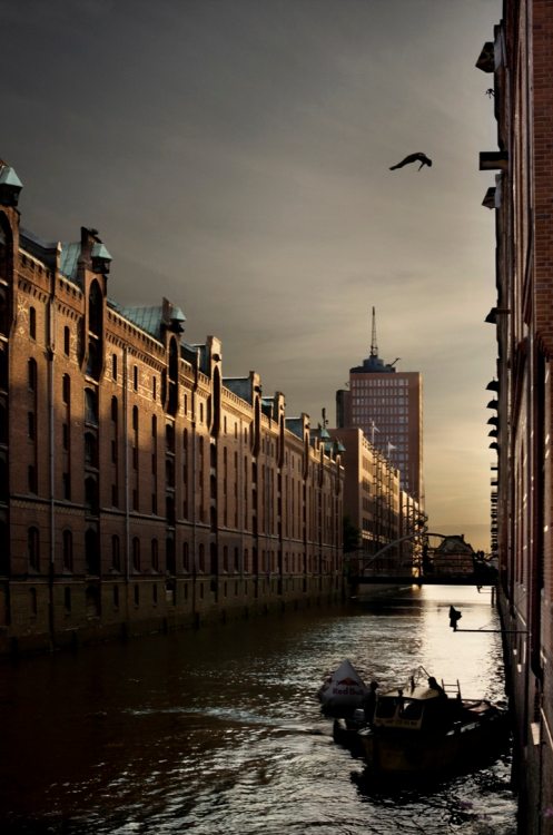
Red Bull Illume is back! The world’s greatest action and adventure sports photography contest is to return this year. Submissions open in December 2012 and photographers can start sending in their best action shots via the official website www.redbullillume.com.
The Image Quest 2013 will be the third edition of the competition after 2007 and 2010. By the time entries close at the end of April 2013, thousands of photographs will have been submitted. The 50 best images in 10 categories and an overall winner are then selected by a team of judges — photo editors from prominent international publications. These 50 finalist images then travel around the world as a unique and stand-alone night-time photo exhibition. The overall winner will receive the new Leica S camera while category winners will receive the Leica X2.
The contest consists of 10 categories: lifestyle, playground, energy, spirit, close up, wings, sequence, new creativity, experimental and illumination. Last edition a total of 22,764 images were submitted by 4,773 photographers from 112 countries. Chris Burkard’s ‘Perfect Day’ shot of surfer Peter Mendia riding the waves off Chile's west coast won first prize.
2007 & 2010 judge Paul Sanders, former picture editor of The Times, says: "Red Bull Illume is one of the best competitions in the world. The standard of photography and talent is amazing, the imagination of the photographers is incredible. I find looking at the images breathtaking."
The entries feature not only dramatic images such as kayakers plunging off waterfalls or climbers scaling impossible cliffs, but behind-the-scenes images of the lifestyle around surf, skate and other action sports.
The submission phase is open from December 1st to April 30th, 2013. Visit www.redbullillume.com for more details.
FREE IMAGE LIBRARY:
All our images are free for editorial use in the context of Red Bull Illume. We only ask that you credit the photographer and send us a link or copy of the article.
The 50 finalist photos can be viewed on our website, www.redbullillume.com. High res versions, videos and more can be found on the Red Bull Content Pool, www.redbullcontentpool.com.
You can also download the 50 finalist photos at the following link:
http://clients.zooom.at/_ftp-RBillume/RedBullIllume2010_Top50.zip.
You can also create your own custom gallery of action shots for your website, selecting the sports that are of interest to you here:
http://www.redbullillume.com/interactive/custom-galleries.html
Or download one of our custom-sized photos for your Facebook cover picture:
http://www.redbullillume.com/interactive/facebook-covers.html
For all media enquiries contact:
Tarquin Cooper (zooom productions)
media@redbullillume.com
Phone: +43 6226 8848-25
About Red Bull Illume:
Red Bull Illume is the world’s premier international photography competition dedicated to the world of action and adventure sports. Its purpose is to showcase the most exciting and creative action sports photography on the planet as art and bring the public into the world of action sports.
Leica is the official partner of the Red Bull Illume Image Quest for the second time, following on from the successful 2010 edition.
www.redbullillume.com
Facebook.com/redbullillume
Twitter.com/redbullillume
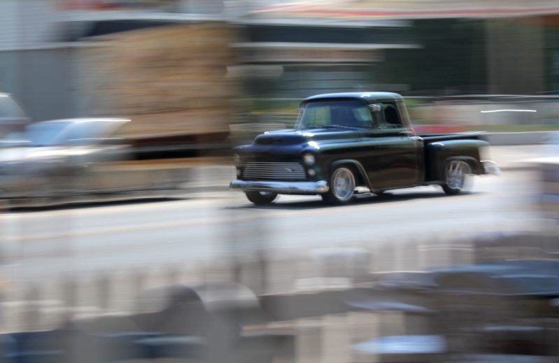
I've a few minutes to write something and noticed this shot so I thought I'd paste it up here. First motion blur I ever did was by accident, I was shooting my girlfriend back in the early '70s while she was skating in a dark arena. The old spotmatic had a 1.4 lens and it was wide open and tracking her as she went past. When the shots came back from the drugstore that blurred image really impressed me.
Simple in concept, you adjust so that you need a long exposure and then swing the camera with the subject as it moves by. In this day of massively high iso digital cameras it is a bit hard to do this. I bought a $20 variable density filter and used it to cut the noon-time beach light back so I could do a... just looked at the exif info... 1/8 second exposure at f5.6 (probably the widest aperature I could get on this kit zoom.)
The specific technique isn't important, just get the shutter slowed down somehow and track the movement. This is even more fun with digital cameras because you can see what you're getting right away.
If the nude is, as Kenneth Clark says, a genre in itself, rather than the subject of the art, we can start to think of categories of nude art.
How about:
- The shameful nude: Take photographs of people who are deeply ashamed to be naked.
- The embarassed nude: Shots of models so obviously comfortable naked that the viewers are embarassed.
- The covered nude: Underneath this I am naked!
- The male gaze nude: High heels and stockings of course.
- The implied nude: Work using models who want to be paid but don't want to admit the only paid model work for girls of their size is for nudes.
- The classic nude: Snapshots of naked women.
- The edgy nude: Snapshots of naked women with a red gel on a light.
- The abstract nude: Shots resulting from cameras dropping from sweaty hands just as the shutter is released.
- The landscape nude: We couldn't afford the studio rent this month.
- The environmental nude: Green gel.
- The narrative nude: Shots done with a telephone, a glass of spilled wine and a crying model.
- The journalistic nude: Got a new remote controlled webcam!
- The subconscious nude: Click the shutter, click the
shutter, click the shutter. Otherwise known as the
automatic-pencil-of-nature nude.
Shooting Artistic Fine-Art Nudes
I'm looking through a lot of how-to books on the nude that I acquired recently, and sadly, one of the common features of the genre is a whole lot of really forgettable photographs. Each and every one talks of artistic fine art and what they show is garage-level glamour.
There's nothing inherently wrong with the sort of nudes you will find in these books, but it's forgettable, gone in 30 seconds. The images are as bog-standard as the advice. Some folks go to a new town and eat at a chain restaurant because they don't want to be surprised...
Now, far be it from me to say "get a style" but really, at least hunt for something that isn't what every local photographer does when she shoots "boudoir" for the woman next door who's looking for something to give the husband on their ten year anniversary.
Aspire.
Eat at Joes Diner, home of the 50cent bumbleberry pie once in a while.
Can you name 10 nude photographers off the top of your head and picture their work?
OOOH, a LIST! .... Yuck it up folks.
I'll list them, top of my head so no particular order or even a complete list. I'll correct the spelling later and provide a shot found on the net and repeated here in the interest of fair use and education... although in the age of tumblr why bother trying to be copy-correct?
Below you'll find the word "partner" in places, this means wife, lover, otherwise involved romantically and or businessly. Go look these ten up on Google Images and see if you can't detect a certain point of view, a certain unique flavour you won't get at the local mall food-court.
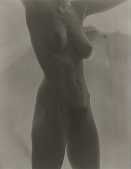
1. Alfred Stieglitz: Shots of Georgia O'Keefe, his partner. The one that sticks in my mind is O'Keefe in front of a screen door.
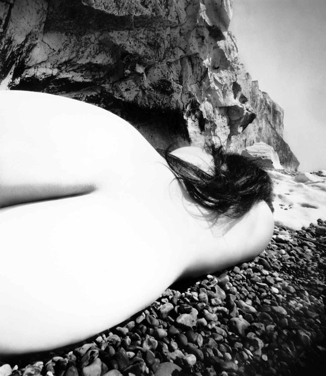
2. Bill Brandt: A wide angle police camera, a nude and a rocky beach.
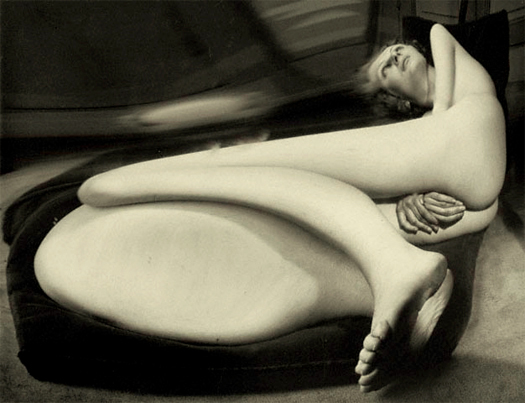
3. Andrez Kertesz: A fun-house mirror.
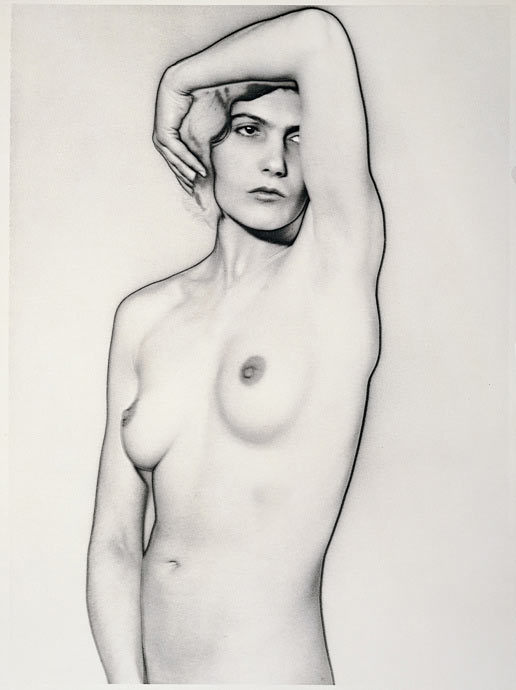
4. Man Ray: Are you kidding, what hasn't he done, what to pick? Let's pick solarization and Lee Miller, his partner.
5. Harry Callahan: And Eleanor, his partner.
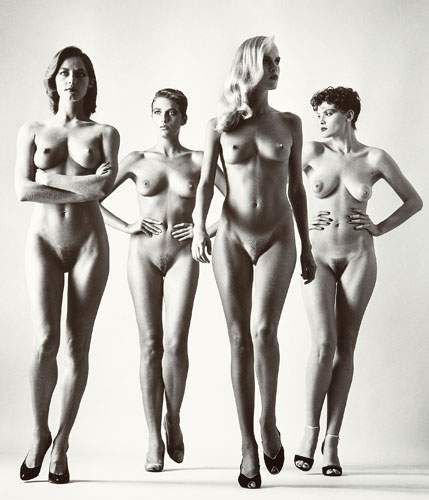
6. Helmut Newton: Big Nudes and big supermodels. This is what most glamour guys have in their heads when they're shooting internet models I suspect.
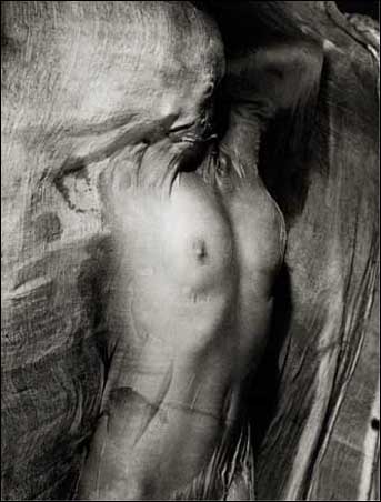
7. Erwin Blumenfeld: Wet silk.
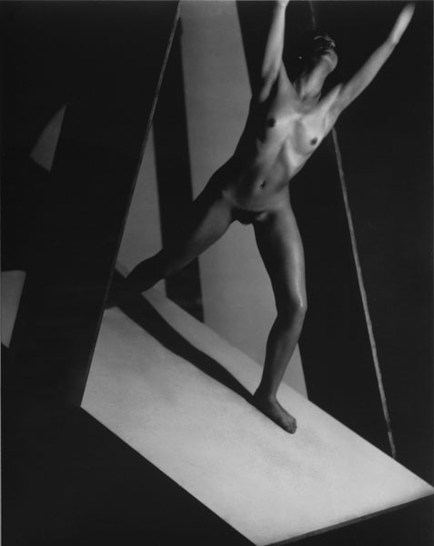
8. Frantisek Drtikol: Shape and Form
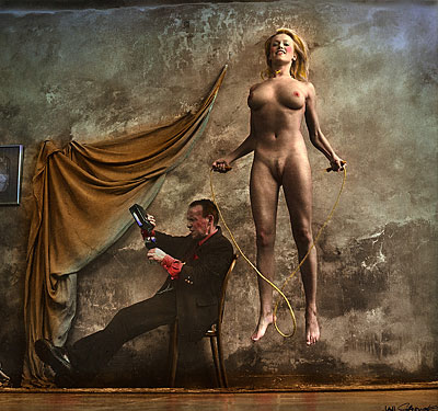
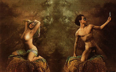
9. Jan Sudek: A true "garage-studio" shooter who worked in his basement on images that would have got him thrown in jail if the authorities knew he was doing it. Partners and neighbours and others he trusted were subjects of his hand-tinted explorations of the human condition.
10. Rudolf Koppitz: Probably one of my very favourite nudes of all time, a real story-image from some dancers in 1926.
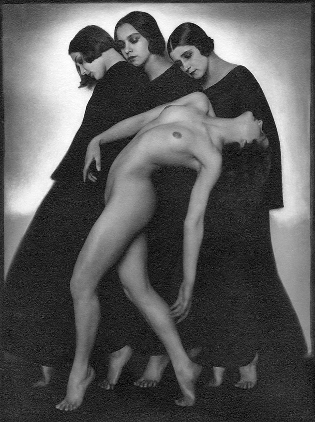
So the first ten that popped into my head, what can we say about them. Many of them shot those they know well, their partners. It's difficult to come up with risky images with a stranger you've met on an internet modeling meetup site, about the best you can do is say "I want to shoot stuff like this picture on your portfolio" since you know he or she will do it. Stretching a little? Something risky? Best know your model a bit better than an email trail.
All the guys up there in the list shot women mostly, is this how it goes? Guys shooting girls they're sleeping with? That's what it needs?
Of course not, but it needs models who trust the artists because they're artists, not guys who use cameras to try and get laid (there's websites other than the modeling sites for that) or want to see real, live nekkid wimmin (go to the strip joint for that). As for only women models, how about men who shoot men?
Herb Ritts, Bruce Weber, Greg Gorman, Horst P. Horst, Robert Mapplethorpe.
Wow, those guys are as guilty of shooting the young and beautiful as any other fashion-related photographer. Access to the cut and the cute seems to mean cut and cute models. A Helmut Newton female looks a bit like a Herb Ritts male to me... all hail the white seamless! Irving Penn is one fashion photographer who resisted this temptation when he did his "Earthly Bodies".
Women who shoot men? Sally Mann and her partner Larry, Imogen Cunningham and Roi, her partner.
Look these names up and examine their work, is it memorable? What are they shooting? Obviously what interests them, but you shoot what interests you right? Interest might not be enough, finding something new to say, that's the ticket. OK I'll fill in the shots above so we can talk about them specifically.
Alfred Stieglitz
Oh, I see that shot sold for 1.3 million plus in 2006. I'm obviously not the only one who likes it. Stieglitz is a giant in the history of American photography, one of the folks who took photography out of the baby-photo-studios and into the art galleries. He was also influential in bringing Modern Art to the USA through his gallery 291. His life is worth a read if you have any interest in American Art, at least check out the Wikipedia entry. Torso was shot in the kitchen of a rural house with a hill in the background beyond a screen door. You don't need dozens of lights to do a memorable nude.
On the other hand, Steiglitz was as capable of cheesecake as the next guy with a camera. Check out this photo which, I suspect, will not sell for as much as Torso.
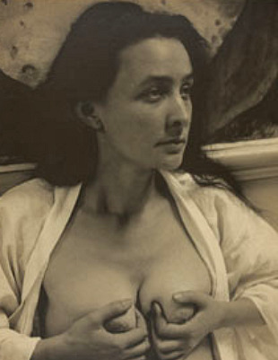
Only on the net would that one float to the top.
Bill Brandt
Who would have thought of using a police crime scene camera, almost a pin-hole, to get a "mouse-eye view" of the nude? Brandt shot for 16 years with an antique camera to create his series of nudes in the '40s and '50s.
Andrez Kertesz
One burst of nude work in 1933, in a lifetime of photography, but what a burst. Taking a couple of funhouse mirrors, Kertesz produced one of the best-known series of nudes.
A lot of the notable nude photographers you'll see here have a large body of work outside their nudes. Having a wide range of subjects, and much experience will give a photographer the confidence to experiment while facing a nude model.
Man Ray
If ever there was the bohemian artist, May Ray might fit the bill, American ex-pat moved to Paris in the '20s and living the life that so many movies depict. In fact I can't believe there isn't a movie about this man who was a member of the "lost generation", photographer, painter, cinematographer and writer. Lee Miller left New York as a model and arrived on Man Ray's doorstep to become his assistant, model and partner before moving on to become a photojournalist in her own right.
Harry Callahan
Harry married Eleanor in 1936 and photographed her for the rest of their 63 year marriage. What further lesson do we need?
Helmut Newton
Tight bodied supermodel in high heels on a seamless white background being tough for the camera. It was done supremely well by Helmut 30 years ago, why am I still seeing attempts at this shot? One who did manage a good comment on the original was Leonard Nimoy who has been featured in the 180mag story This Is What I'm Doing.
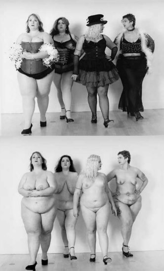
Yes that Leonard Nimoy.
Erwin Blumenfeld
If anyone carried on the experimentation of Man Ray into the next generation of photographers it was Erwin Blumenfeld, his work is well worth a look for those who think that fashion/art photography is a new linkage.
Frantisek Drtikol
Drtikol is becoming better known but he languished for many years in obscurity, at least in my experience. If you look at my work for the past decade or so you may find some resonance here, I've long been fascinated by his combinations of simple shapes on the stage combined with models. I keep working at it, trying to find my own take. As Uncle Miltie once said, "If you're going to steal, steal from the best."
Jan Saudek
Is Saudek really the only living photographer in this list? Surely we should not get the idea that we need to be dead to be great, or even from Central Europe, as I look again over the list. Remember these were the first ten that popped into my head, but they have all made a big impression on me. One of my greatest delights was finding a well-worn copy of a book by Saudek in Czech behind some how-to silliness in a used book store. As for male nudes from my original list, Jan does many.
Rudolf Koppitz
I didn't know which of his shots of dancers and nude to include so here's the second.
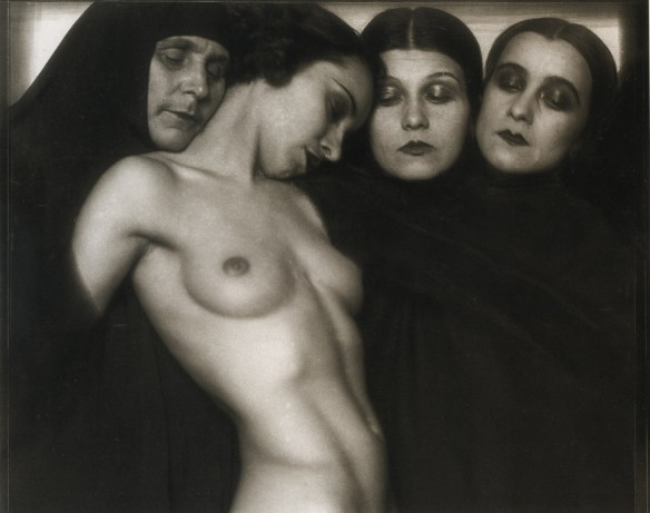
Now that you're at the end of this article, think a little and see if you can't recall a few of the shots you just looked at. Now think if you can remember ten more shots from different photographers. Are any of the remembered shots what you might see on that modeling website?
Stop looking at the mediocre and start stealing from the best. Above all, don't listen to what you "should be doing" with regard to lighting, posing or what have you. Look at these shots again if you like them, or find ones you like better and look closely at the lighting. If you can "see" the lighting ask what that means. I like lighting, I make a lot of my shots all about the lighting. I should stop that if I want to do work like these we've looked at today.
Humans love lists. The top ten, the new year's resolution, the classification of life on earth, it's all lists.
How can we classify writing? Scientific, fiction, non-fiction, adult, teen, fantasy, philosophy, religious?
OK I just pulled those out of the air, can we do the same with the classification of the animal kingdom? How about photography?
Scientific: The classification of animals into genus and species of course, we're homo sapiens.
X-rays
Fiction: Hippogriffs
photoshop
Non-fiction: Cats
journalism
Adult: adult
porn
Teen: teen
illegal porn
Fantasy: Pegasus (or purse dogs)
glamour photography (or porn yet again)
Philosophy: Orwell's "Animal Farm" or veganism
surrealism or dada
Religious: doves
shroud of Turin
So it's not too hard to find equivalances to these classification schemes in photography, that means we can take any theoretical analysis of writing or of animals and probably just substitute.
Ought to be a few dozen easy post-grad theses in there somewhere.
I was reading a book at the studio today, and the author joins a long string of folks trying to explain what a photograph is, and how to look at it.
Honestly, I'm not sure why I keep reading these essays. We've been looking at photographs for over a hundred years and at paintings for hundreds before that, we certainly know how to do it. I've been exposed to images for my entire life, about five or six more than I have been exposed to written language so interpreting images isn't really a chore for me, or for anyone else.
Images are a language, a two dimensional "written" language that is a bit more universal than English or Chinese, but subject to the same local interpretation. By that I mean the word combinations or the image will mean a slightly different thing to someone in one social area compared to another. To be clear, swear words in England are not the same as those in the USA. Local slang will differ and so will the interpretation of various elements of a photograph. But every person on the planet can see a photograph and interpret it. Written language is more restricted in that only a certain subset of humans can read a particular language.
Thinking in a different language is supposed to engender a different set of ideas. I'm unilingual so I can't say if that is true or not, but if it is, it's a wonderful thing and I wish I was fluent in French as my daughter is. Funnily enough, my daughter can't tell me if she thinks differently for having two languages, she's had them so long she can't tell if there's another way of thinking from the way she does it. I see what she means, I can't tell you if I would be thinking different things in Japanese as compared to now even if I learned the language. Here's the theory for anyone interested http://en.wikipedia.org/wiki/Linguistic_relativity
I doubt photography would be as useful as language for seeing different things, (assuming language is of course). A photograph of a Cambodian kid is pretty much the same as a photograph of a Canadian kid if it's taken by the same photographer. More likely would be to see a different world view if a Chinese kid was photographed by a Cambodian photographer and a Canadian photographer. The different viewpoint would be in the photographer rather than in the image content, the "text" of the photograph would more likely be different from two photographers rather than from one.
Rather a "duh" moment there I suppose.
We had a photo contest recently and the winner was a nude in nature with some mud-like substance on her. The theme was "balance" and I immediately said "nude in nature is not balance, it's reality, mud on girl is a bit obvious (messy/clean) and beside I don't like the way she's got her thumb in her fist". The other judges liked it and so I looked again, reading closely rather than skimming the shot. Well written (printed), OK now I saw a mano fico rather than an awkward fist. A baby born with a mano fico is said to be lucky so now we have a reference to birth and nature, man in balance in nature, we're born naked and wet and we die clothed and dried up... and so I continued for a while until someone shut me up. I later talked with the photographer and found out the mud was actually frozen paint and so this rather tough model was likely just clenching her fist after all, and with good reason.
As a writer may have a story or poem interpreted by the reader, so may a photographer have an image "read" in different ways by different viewers. It's all communication, all language. It follows then, that some photographs will be blatantly obvious (advertising shots come to mind) while others may be a bit more subtle in their message and some may simply be gibberish.
Tell a good story.
Have been hanging around the U. Guelph photo arts club for a while as a member of the exec. An anachronistic bunch, the club is mostly concentrated on film with two nicely equipped (if antique) darkrooms that are about the same as they were when I worked in them in the late '70's. (I'm there for the studio of course, tiny but useable and there are ways of making a small space large.)
It's been rather interesting dredging up my old knowledge of silver photography, but most important for me to realize is that I have started to slip into the digital way of thinking. That's where you shoot everything to perfection, fully in focus, perfectly lit, in colour, blah blah blah just in case you change your mind later and decide to do something different from what you had in mind originally. Yikes, was a time when I didn't have any post processing choices beyond using different contrast paper and dodging or burning. Colour was something I painted on later.
 This is a mistake. You don't provide more choices for
yourself by shooting in raw at full pixel size with tack sharp focus
and on a tripod, you cut yourself down to producing the same photos
that everyone else does, and the only way for you to "improve" is to
buy a camera with more megapixels and a bigger sensor, a heavier tripod
and the latest editing software.
 The simple problem is this, if you don't know what you want to see in the shot while you're shooting it, you aren't going to see anything different as you sit in your office chair in front of a monitor. I've been watching a few folks do their first nudes and having fun seeing them discover the images on their screens. While looking at nudes online I don't see the same experimentation, instead I see the same thing over and over, it's almost always a full body shot, nice lighting, well focused and all the other things you expect to see. I'm wondering if there's a question of rarity here... "I may not get a chance to shoot this girl again, or many more nudes, so I'd better do it right". And of course you end up with what you expect because what you expect is what you see all the time.
I try not to think that way, at least for nudes, and it works in my favour. Potential models who see my work see something that isn't what they expected, something that they'd like to participate in. There's really no shortage of nude models out there, just a shortage of those who don't see the point of doing something that's been done thousands of times before.
So shoot it in the camera, figure out how to do everything you want to do while you're shooting it, and save the fancy editing program for any fine tuning you need, instead of spending hours trying to find the image you had in your mind before you produced the one the engineers at Canon figured you wanted to make.
Yesterday we presented f/w collection, we did video show.
http://vimeo.com/39155121
Ksenia Schnaider
<info@kseniaschnaider.com>wrote:
A very nice video short worth checking out.
Dear Kim,
I recently completed a new multimedia piece called "Thom" that I wanted to share with you, This 4-minute piece incorporates video, stills and interview, along with original music. Let me know what you think!

Best wishes, Anja Hitzenberger
photographs © anja hitzenberger anjahitzenberger.com strudelmedia.com
Let's assume you've considered all the movements and whatnot of photography and you're going to be working with people, that's what this workshop series is all about anyway, so it's a reasonable assumption. If you're going to be doing landscape photography you can skip this workshop, trees don't take well to posing instruction so you're going to have to be more concerned with finding the right viewpoint than making the mountains arrange themselves in pleasing shapes.
Preparation
Remember you're going to be working with other people, it's always good to have a bit of an idea what you want to do when you get together, that way you don't waste each other's time.
When I teach a posing workshop it's offered to both photographers and models, and both can benefit from the information below, which is based on advice from other authors, my personal experience as a life model in a University, and my own photography of models. You should take all this to be advice which will get you the expected results, what most people find most pleasing. They are "the rules" of posing.
Learn the craft
Check out magazines for the poses. What works for those models will work for you. A photographic model has a set of short duration poses, like gesture drawing poses for an artist's model. Photographers rarely need a model to hold a pose for 50 seconds, let alone 50 minutes so consider what you're looking at when you study paintings and sculpture. Those models likely held their poses for minutes at a time.
Learn to recognize what mood and style the photograph has, and how that was achieved. Look at the position of the hands and feet, the eyes. Look at the clothing and think about how it was used to reinforce the pose. Be critical of what you look at, could you have done it better?
Make a clipping book
Keep tear sheets of the photographs you like, and those that give you ideas. Keep them handy and look at them often, there's no sense reinventing the wheel. If someone else has done the work why should you not build on their efforts?
Practice
Models, get in front of a mirror and practice the poses you think will work for you. Now invent some of your own, this is easier if you simply take some of the postures you normally use. If you're a dancer, dance and hold a position, if you do yoga, stretch and look at it, if you are a runner, sink into your pace and check what that looks like.
Now is the time to find your good and weak points, decide which features you should put forward and which you should keep in the background. Don't forget to make faces, learn how to give different expressions when called upon. Modeling is acting, you should know how to be angry, shy, sultry and sweet.
Move with grace
Pay attention to how you move from one pose to another, the smoother you get the better you will be as a model, it's often these transition movements that will actually make the best photograph. Photographers, watch your model carefully, check out the poses between poses and either catch them or ask the model to hold when it's right.
Exaggerate the makeup and clothes
The camera damps things down, remember to overdo the makeup a bit, and dress a bit more daringly than you might when going to work. Think theatre makeup, the kind onstage rather than the kind in the audience.
Makeup during the shoot
Models, check your makeup often, or ask someone to look if you think you've disturbed your makeup. Keep your lips moist by licking them regularly. If your mouth is open run your tongue over your teeth as well, to keep them moist and shiny. Photographers, don't forget to check the shine.
Shoes
High heels make long shapely tapered legs with nicely curved calves. They make a more dramatic curve in the lower back that emphasizes the buttocks and the chest.
Props
For beginning models especially, it's good to have a few props ready. Hands can do some strange things when left on their own, they generally settle down and behave if they're holding something. A model who has trouble standing in an interesting way might find it easier to lean against a stool. Each prop will give you new ideas for a pose, a new look for the image.
Makeup and hair
The studio should have, at a minimum, a makeup area with good lighting and a mirror. A place to wash up, an emergency brush, hair clips, pins, hairspray, gel, soap, mineral oil and various other items are often needed. Many models will forget to bring these things.
Check this link for a list of things a model should have with them. Information for models at any photoshoot
Posing
Good Side, Bad Side
Everyone has a few flaws, even if it's just a temporary facial blemish. Models, by concentrating on the other side of your face during a photoshoot you will reduce the amount of retouching needed. If your eyes are different sizes you can minimize the difference by turning the larger eye away from the camera in a 3/4 profile, this will mean the smaller eye appears larger because it's closer to the camera, and the descrepancy will even out. Crooked nose? Figure out which angle works best with your particular dent. Most people will want to put the narrower side of their face toward the camera which means if your nose bends to the right, use the right side of your face. This also makes your nose smaller.
Acting as a model
Every photograph tells a story, try to figure out what story you are telling with each shot and put that face on. If you are sitting on a chair and it's raining you might want to slump a bit, round your shoulders, hitch up your collar and drop your head to keep the water out of your eyes. On the other hand, when the sun comes out you will lift your head and feel the sun on your face, of course you'll smile.
Even if you're doing a product shot, holding up a bottle of shampoo, it's the best shampoo you've ever seen, you're just delighted with it! Make sure your body and face reflect your delight.
What style pose is it
Pay attention to what theme you're working on. Does the pose call for a direct gaze at the camera or should you be looking down and away. Should your arms be quiet and restful or active and reaching out?
Point those toes
When you point your toes all sorts of good things happen, your legs get longer, your calves get shapely, and if you're on the balls of your feet your posture gets better. Even if you're just doing headshots you should be aware of good posture. Standing flatfooted can also mean that your shoulders and head go dead. If you aren't wearing high heels, pretend you are by pointing your toes.
Unlock your knees
Just as you want to point your toes, you also want to keep your knees bent. This puts a curve into the leg, and keeps your posture alive. If you lock your knees the legs bend backward and the emphasis goes onto the thighs.
Head angles
A full on face shot makes for a round face. It's usually more flattering to turn to a slight angle. Learn how your face looks from a profile to a full face shot and all the angles in between. A good standard angle is a 3/4 shot, with both eyes visible to the camera.
Lines
For women they say it's always good to have the shoulders on an angle, and to tilt the head toward the near shoulder, aiming the head and the body in different angles also helps create interest in the shot.
Men should tilt their heads toward the far shoulder and keep their shoulders level.
I don't know why, try it and see what it looks like.
Smile
Don't be afraid to smile once in a while but remember that smiles cause lines on the face. A relaxed face with no smile or a very small quirk of the lip combined with alert and sparkling eyes can convey as much emotion as a full bore smile.
If it bends, bend it
Unlock your joints even when you're using them to support yourself. If you lock your elbow when you lean back on your arms the arm will bend backward and the shoulders will hunch up toward your head. Keep everything nicely curved in the direction we expect to see it bent.
If you're leaning on it, don't lean on it
Don't put weight on an arm that you're "leaning" on, instead hold yourself with your stomach muscles and rest the arm as if it's a prop. This will give you a "lighter than air" feeling. Be careful of leaning your head on your hand too, this can scrunch up your face. Fingertips not palms.
Separate whatever you can separate
Keep the fingers slightly apart and resist the temptation to make a fist, this can make it look like you're missing fingers. Move the arms slightly out from the body, move the legs slightly apart from each other. If you sit on the floor with your knees drawn up, pull one slightly further in than the other. Symmetry rarely looks good in a pose.
Hands
Hands deserve special mention as they're the second most interesting thing in the photo after the face. The flat surfaces of the hands will become exaggerated in a photo, show the edges instead. Don't point the fingers at the lens as this will give you fat fingers. As mentioned before, bend the joints and open the fingers a bit. Don't clutch at things or intertwine the fingers as this makes the fingers disappear.
Relax
When the photographer says he's going to shoot you, don't act like you're in front of a firing squad. Treat the camera as if it's a person you're having a conversation with. In fact the photographer will likely be mumbling into the back of the camera so pretend it's his face.
Make wavy lines
Women should be curvy, even in their posture. Move the hips one way, the shoulders the other, and tilt the head. Think of swaying lines running down through your body. This gives pleasing lines for the eye to follow in the photograph.
Lift your arms
The chest will rise, the stomach will get thinner, the torso will become longer. Similarly, move the elbows back to open the chest. Push the head upward (but keep the shoulders down). If you're sitting down, rock your hips forward to lift and expand the chest while reducing the stomach. You don't need to be wearing high heels to get that high heel effect.
Don't blink
Some models have a real talent for blinking as the shutter trips. Try to blink between exposures, you'll soon get into the rhythm of the photographer and will know when you can blink. As a general rule, when you set your pose, stop blinking, breath in, open the chest, lift the head and think of yourself as being lighter than air. For photographers who have to work with a blinker, try to time the shot for just after they blink.
Look at something
While we're on the eyes, make sure that you always look at something in the room, unfocused eyes are disturbing in a photograph unless you're working on the memento mori theme.
Hold that pose
If you've moved into a pose and the photographer suddenly starts to adjust equipment, don't move, he wants to get that shot. On the other hand, if he moves away from the camera to fiddle with lights or props you can relax a bit but don't move off your mark, he needs you in position while he fixes things.
Photographers, when you make an adjustment say "hold that pose please" or "relax but keep on your mark I need to fix the lights". Models don't read your mind until the fourth or fifth session.
What to shoot
Always think portfolio
Even if you're just doing a portrait you should think of doing a full portfolio type shoot, moving from headshots to full body length poses. It's a good idea to make it a habit to move from one extreme to another. Since most models will automatically arrive ready for a head shot, it's often easiest to move from there back to the full body shots. Why do they arrive ready for a head shot? Because they sat or stood in front of a mirror which only showed them the head, fixed their makeup and adjusted their jewlery and clothing. They're ready for the head shot.
Head shot
Always think of a tight, black and white head shot as if for an actor's portfolio. Get in close, make the lighting flattering but slightly dramatic, do full, three quarter and shallow silhouette shots at least. While you're doing this you can be getting acquainted with the face, and with the model. Next switch to colour (if you're shooting digital that just means switching your thinking since you'll likely convert colour to black and white later). You may want to bare the shoulders if the clothing is a bit distracting.
Head and shoulders
Shots from head to mid-chest are also done along with the tight head shot to bring the clothing into the image. There isn't a lot of posing to be done here, but remember to keep the head light, the shoulders down and relaxed, and to use the hands to best advantage.
3/4 length shots
From head to mid-thigh, this allows you to start working with poses while still staying simple and working with the face as well. In some ways the 3/4 length shot is the most complex. You can start changing outfits now, and using the props.
Full length shots
Here is where you start working with the body and the poses that involve the legs. You will want to alternate between full body and 3/4 shots as you make clothing and prop changes. It's also not a bad idea to sneak in some head shots once in a while. As the model holds a full length pose the head will come alive and the eyes will sparkle more often than when simply sitting in a chair.
Full length shots are used in a portfolio to show clients a model's body type. The pose should show the figure to best advantage, which usually means narrow hips and wide chest. These shots can be casual, jeans and t-shirt, or more formal clothing as long as it's body-shaping.
Themes
Once you start the wardrobe changes you need to think about the theme of each photograph. Think how disturbing it would be to see a model in lacy panties and a bra swinging a tennis racquet or taking dictation. Mind you, I'm sure you've seen those exact shots and they work because they are working against type.
For a model's portfolio you should try to get several different themes and make the model look as different, one from the other, as possible. This will show her range of characters and allow her to show that she can work in several different areas.
Formal wear
Think weddings and the opera. You'll need appropriate makeup and hair for these shots but they're good in a portfolio, often they can be combined with a casual shot to show the model's range.
Club
Playful and daring. You can go with extreme makeup and poses here. It's often a good idea to turn up the music and let the model dance, just fit in with the music and pretend the strobes are, well, strobes.
Business corporate
This is sober and subdued but tasteful. Try to imagine walking or sitting around the office discussing work. Smiles will be small and laughter will be minimal but it isn't a serious situation. We like to work right?
Casual
Relax relax relax. Drape that leg over the arm of the chair if you're young. If you're older, drape the arm across the back of the couch and lean slightly to the side.
Swimsuit
If you have a great body and it's tight, go for the bikini shot, otherwise a full length suit may be more flattering, especially one that shapes the body. If you're in a bikini for goodness sake remember that you're on the beach having fun, arms and legs all over the place. Police mug shots in swimsuits are not very interesting no matter how good you look.
Lingerie
A lot of lingerie is more concealing than a bikini but models are often self-conscious in their undies. Make sure the temperature of the studio is warm enough for comfort, and make sure the model feels comfortable. It's rarely a good idea to start the session with lingerie shots, especially if you've never worked with the model before. Mind you, if the model is not comfortable in lingerie, why are you shooting lingerie? The only reason I can think of is if she's paying you to shoot it, then she can be as nervous as she wants.
Glamour
Modern "glamour" shots aren't the same as those of the 40s. Think pinup rather than high fashion. Glamour shots emphasize the chest and hips, the curves of the body. The model should, according to modern tastes, look directly at the camera. Posing with the arms up in the hair, chest out, legs crossed suggestively and looking up and away will give the shot an old fashioned feel.
Fine art
Fine art and nude work is more similar to posing for painting than it is to photography. Conventions will shift a bit and the poses will become more conservative as the model is asked to hold them for longer periods of time. As a model working in this field you should think about how you fit into the artwork rather than try to put your personality forward. You are part of the creation of a piece of art rather than the subject of that artwork.
Let's face it, once you're away from "glamour" and into "art" the model becomes less a person and more a prop to reflect light.
Fine art nude
Posing for fine art nudes is difficult. The lighting tends to be very directional and the image is much more about light, shadow and form than it is about the excitement of the body in action. Poses are long and require minute changes in position to catch light from this or that angle.
On the other hand, wardrobe and makeup are rarely a problem.
Fashion Model Shots
A special note here in case you are going for shots for a model to take to an agency for a look-see. Go back to the bikini and take four mug shots. Front, sides and back. That's it. The agency will see the smiles and how the model moves, what they need (and by the way they will usually have a t-shirt, a blank wall and a digital camera to take their own mug shots) is a record of the model's body.
Fixing problems
For Pale Skin
Pale skin will "blow out" easily with high contrast lighting, use a more even, lower-contrast lighting setup.
For Bald Men
Lower the camera position so you aren't shooting down onto the bald spot. Sidelight from the model's eye level rather than use a hair light from above.
Dark or light hair
If the model's hair is a different colour than the background beware of stray bits that will allow the background to show through, this will make the hair look messy or thin.
Round or Fat Faces
Shooting straight on gives the face it's widest look. Shoot 3/4 and light the face from the side away from the camera (short lighting) this will put the cheek facing the camera into shadow and further narrow the face. Most people have narrower chins than foreheads so shooting from a lower position may also help thin the face. Some people have very square jaws, these too benefit from 3/4 shots.
Thin faces
Shoot straight on and broaden the light.
Marks on the face
Wrinkles, scars, prominant pores and acne all benefit from a softer more even light. Concealer can help a lot to fill in problem areas, and the use of shadow can hide some scars. Of course it's also quite tempting to work on these problems digitally as well but the more you do in the studio, the less time you spend at the computer later.
Big ears
Ears that stick out can be treated like a round face, by shooting 3/4 or profile. They can also be hidden by the hair or put into shadow.
Different sized eyes
This is often addressed by putting the smaller eye forward, letting the natural tendancy for closer things to look bigger in the camera even out the size. This effect will be greater with wider angle lenses since they allow you to move closer to the subject, exaggerating the apparent size differences. On the other hand, you may want to pose the larger eye forward to take advantage of the preference for big eyes humans show. In this case you can throw the smaller eye into shadow.
Deep eyes
For people with prominent eyebrow ridges or deep set eyes, get some light into them by having the model look up, look into the light, or using a reflector or fill light from a low angle.
The nose
If a nose is big, you can minimize it by aiming it straight at the camera. It may also help to tilt it upward. Most people have a nose that's bent to one side or the other, use this to make the nose smaller by doing 3/4 shots from the side toward which it bends. A large nose can also be minimized by using a longer lens and backing away from the model. On the other hand a small nose is made bigger by shooting it from the side or shooting the profile away from the bend.
Double chin
Double chins can be minimized by stretching the neck upward and forward and leaning the head toward the camera. Shooting from a higher angle will also minimize the neck.
Glasses and jewlery
Check the lights to make sure you're not getting reflections from shiny objects that will distract from the photo.
Posing couples
Pose them in relation to each other, either looking at each other or both looking the same way. Bring them close together with lots of space around them for an intimate feeling. The more space between them the closer to divorce.
Posing groups
If you're shooting a group, it's "a group" so arrange the models in such a way that there's some sort of connection between them. Have them physically touch or visually overlap each other. Watch for people on the end who've been "cast out" and cut off from the group.
Remember those school pictures? Try not to arrange people according to height, let the differing head heights cluster into sub-groups to create some interest.
It's a good idea to try and get everyone wearing clothing that blends, perhaps ask the group to all wear light tops with dark pants. If someone shows up in hot pink and everyone else is in white, you'd better put the hot pink in the middle of the group, no wait, 1/3 of the way from one end.
Final comments and Assignment:
Having a hard time remembering all that? Don't worry about it. Your job now is to find seven people to pose for you near a bright north facing window (no direct sun). Shoot with your camera set on automatic, no flash. Stand well back and zoom in, stay to one side of the window, don't shoot directly at it. We're working on posing today, not camera technique so concentrate on the model, in fact, if you've got a tripod, set it up and use it to keep your feet from wandering away from your chosen position.
Look at your models hard, try to find a way to make them look as good as possible. You'll spot the flaws, it's your job to find the solutions. You can try asking them to "look around the room", to move their gaze from one place to another until you get shots from all angles. Now move out for 3/4 and full body shots, have them stand and look out the window, into the room etc. etc. and don't forget to give them a chair to lounge around in. Set the camera around head height or a bit lower in every situation, again we're not looking to replicate the internet lollypop head stock shot. (Wide angle, shoot from two steps up a ladder down onto their heads as they look up).
Check your photos afterward and see what you like. Simple as that. Now do it again and concentrate on the poses and angles you like best, see if you can replicate the look you want to see.
The Painter sees
A heavenly glow
in the clouds
above the church spire
promising salvation
in the clouds
above the church spire
promising salvation
The Photographer sees
The dirty frozen slush
in front of the muffler shop
in front of the church
promising another miserable day
in front of the muffler shop
in front of the church
promising another miserable day
And I suppose the Philosopher
notices the difference between them.
Me, I noticed the utility lines as soon as I brought this shot up on the monitor. Sometimes you gotta look at it to see it.
Indeed, subject does matter. What is it that you are going to photograph? If you've got something in mind that's great. Go shoot it now, and shoot it a lot.
For those who aren't sure, but you know you want to shoot something, lets think a bit about photography genre and see where that takes us.
Here's a couple of articles you might want to check out as we start this discussion.
Photographic Art Movements
Movements reconsidered
Classification
How do we classify photography? I can think of different classes of painting, the first that comes to mind is painting vs illustration. One being art and the other advertising I suppose. One you learn at University and one at College?
Can I list any pairs for photography?
- Amateur vs Professional
- Snapshots vs Photographs (amateur vs professional one presumes)
- Digital vs Film (really? still?)
- Commercial vs Art
- Pictorial vs Straight
- People vs Stuff (not people)
Snapshot vs Photograph? Again there's a seriousness factor usually assumed here. If we're going to use this pair of words, I'd prefer we talk about something shot quickly, "from the hip" as compared to something set up and more deliberately created. Think of wet-plate 8x10 photography and the roll-film fast capture images made possible by Mr. Eastman and his box brownie. Slow vs fast, complicated and technical vs Mom can take it. Is Julia Margaret Cameron's shot of Tennyson (a Photograph) better, more serious, more important than a snapshot of the first grandchild in her first hour out in the fresh air? Depends more on who's looking than on how the shot was made I think.
Digital vs Film? Huge difference here, but not in the end result, not artistically and not having that discussion here now. As a photographer you should use whatever you want to use and not fetishize your paintbrush.
Commercial vs Art: Do you want to take photographs for a client or for yourself? This is the assumption here, it's the equivalent to illustration vs painting (art). Of course it's as mucky a split as any other, great artists get commissions, commercial artists do work that is expressive of their own thoughts, desires and wishes to contribute to the cultural discussion of the society. But your question here is your primary reason for photographing, to make money or to make the photograph?
Pictorial vs Straight: This is an old split, you have read about it a bit in the articles listed above. Today I suppose the argument is "photoshopped" vs "in the camera". I would say I'm a bit in the straight category (don't do much post production at all) but I do a lot of abstract work with the camera itself and with lights that makes no attempt to record "the real world" so...
People vs Stuff: Portrait vs landscape/still life/macro/animal/ etc. Of course "stuff" can be subdivided forever.
Assignment:
Head online to any forum or blog on photography you hang out in and find us some more pairs for our list.
More Classification
Some Major classifications and their sub-classifications (more or less randomly listed)
Advertising Photography
- Stock
- signs
- businessmen jumping in the air with their briefcases
- people sneezing
- babies
- other stuff arond the house
- Low Ad (Junk Mail)
- High Ad (Magazines)
- Lifestyle (see stock)
- Catalogue (see the new sofa for your living-room)
Commercial Photography
- Fashion and Beauty (makeup)
- Architectural and industrial
- Food
- Product
- Calendar
- Annual Reports and Business Portraits
- Wedding
- Baby
- Portrait
- School
- Model Portfolio
- Passport
- US Landscape (Yosemite National Park, see snow-capped peak)
- European Landscape (Typology, see 23 shots of water towers)
- Street (snapshots of folks on the street being interesting)
- Nude
- Glamour (come hither looks and covered genitals)
- Fine Art (go away looks and who cares, we were all born
naked)
- Abstract (what is that?)
- Fetish (oh, how did I get tangled up in all this rope?)
- Porn (you know it when you see it)
- Portrait (see below)
- Clique (friends doing naughty things)
- Social Documentary (the homeless and other strangers being cold, hungry and dirty)
- Gothic and Alternative (corsets and fake blood, tattoos and piercings.)
- Gimmick Photography (tool fetish)
- Polaroid (shoot anything, desaturate and add a yellow tint)
- Toy camera (see polaroid, make sure edges are extra blurry)
- Shift-Tilt focus (hey this boring city-scape looks like a toy model now)
- Giant (wow that thing's wall-sized)
- Megapixel (wow I can walk right up to that wall-sized
photo and see little people)
- Beautiful photography (stuff your mom likes)
- Flowers
- Sunsets
- Trees
- Feedback Photography (Flickr and the other modern camera clubs)
- Anti-photography (people dead center in the shot, every-house on any-street)
- Newspaper/Documentary
- Magazines
- Travel
- News/Documentary
- Sport/Fitness
- Geographic/Scientific
- Music (cameras smuggled into a concert)
- Citizen (anyone with a cell phone when things happen)
- Self-reporting (Facebook)
Classes of Portrait Photography
- Environmental portrait: You put the chemist into a lab coat and give them an erlenmeyer flask of coloured liquid to hold.
- Sports portrait: That's an environmental portrait with a
baseball bat.
- Candid portrait: Otherwise known as a snapshot?
- Posed portrait: Not a snapshot because the subject is now posing for the camera.
- Black and white character portrait: You take their cigar away while they're posing and they scowl at you.
- Couple portrait: Two people in the shot, usually they're getting married.
- Group portrait: More than two people in the shot, either
lined up with their baseball bats or cleverly assorted into small
groupings on ladders and planks.
- Big Portrait: You get the old 24" Polaroid camera out and you centre their pimply face on a white background.
- Big Face: Get too damned close with the big Polaroid and their noses get outrageous... then slam on that unsharp mask.
- The Avedon... hell this is the same as 8 and 9.
And neither needs to. We're human beings, we like looking at faces in all their glorious variations.
While we're on the subject of lists:
The Good Photograph Explained
It's time to finally reveal what makes a good photograph. This is what I have learned on the net and from various magazines over the last couple of years.
- It has to be straight from the camera
- It has to be uncropped
- It has to be sharp
- It has to be full depth of field
- It has to be Black and White
- It has to have a straight horizon line
- It has to be at the one and only correct f stop on the lens
- That lens has to have good bokeh even though nothing is out of focus
- It has to be a prime lens
- It has to be on a Leica rangefinder
- It has to be taken with a full frame sensor
- That sensor has to be film
- Preferably 8x10 film
- It has to be printed with pigment inks on archival paper
- That's just the proof, the print has to be silver gelatin
- That's just the artist's proof, the actual print has to be platinum
- Contact printed
- Signed in pencil
- It has to have a stamp that says it's untampered with
- Except for all the usual darkroom things we always did
- It has to be big, like wall sized
- And red
- And mounted on a light box
- It has to use a movie set worth of lights and crew
- It has to be taken in a small town
- It has to feature an empty parking lot
- It has to have garbage over there in the corner
- It has to be taken at night
- No kittens
- Or flowers
- Unless your name is Mapplethorpe
- No point and shoot cameras
- Unless your name is Teller
- Or Richardson (the young one)
- All studio shots must have a minimum of 5 lights
- Main and fill light ratio is 1:1
- And white seamless
- Unless it's an avant guard edgy editorial for a European mag, and then use grey seamless
- All shots of people must include the whole person, no cut off fingers or feet
- All shots of women have to include lingerie, a hat and a cigar
- With flat lighting and white seamless
- All landscape pictures have to look like....
- You know what, we've got "Moonrise Over Hernandez" so forget it, we're done with landscape photography, thank you for participating
- Always remember, Shoot in raw, fix in post.
And that's what I know.
Assignment:
Figure out what you want to shoot and go shoot it a lot.
As part of the workshop series I was going to suggest looking at lots and lots of photos online. Look for composition clues, for subject matter you like, for little tricks with light and colour you can use, and to see what "everybody likes".
While that isn't a bad idea, I often find that looking at too much photography online makes me numb. It's very difficult to concentrate when there's millions of images to flash through. We don't want to look at everything, we want to look at the good stuff. On the net what we often get is the promoted stuff, the stuff that the search engine algorithms pick up best.
From 2007: Having spent a lot of
time on photo sharing and comparing websites, I
have looked at a lot of thumbnail shots and I have started wondering
just what that does to one's selective abilities.
By scanning through what are essentially colour contact sheets I suspect one may find a bias in the shots one chooses to look at more closely. This bias may even explain in part what images and artists float to the top of the rankings at those websites.
Does one develop a bias toward headshots, bright colours, strong, simple geometric shapes and high contrast combined with hyper-sharpened images? The thing is, I just can't see Jeff Wall, Edward Burtynsky or Thomas Struth being hits on a thumbnail-dominated web gallery.
I don't have a lesson here for myself except perhaps to remember "horses for courses", if you're looking for detail-rich large scale art, don't look at thumbnail sites.
Better to be a bit selective in what you're looking at I think. To find new work, I use several blogs, letting someone else sort through the net for me. To think about art I look at online art blogs, again letting curators and artists pre-select new work that I should pay attention to.
For your purposes, as beginning photographers, you should look to the masters. Find a few sites that deal with the history of photography and check out the images. http://masters-of-photography.com/ is a pretty good start.
No matter what you look at, you need to make up your own mind about it. You'll find text with a lot of these images and you should read it, but keep a skeptical eye out. There are those who would make this or that photographer a deity, but none of them are. Of much more importance is for you to find an iconic image that everyone tells you is great, but that you don't like much. Look at that one and try to figure out why you don't like it.
This will tell you a lot about what you want to shoot, and what you want to accomplish with your work.
From 2009: Look at Other Photos
There's the usual advice to any beginning photographer, either fine art, portrait, commercial or fashion. Look at lots of other photographers and lots of photographs.
Seeing that we swim in a sea of photographic images I really don't know how one would avoid looking at lots of photographs, but is it a good thing to do?
If one is a local baby and high school senior photographer I suppose one should look at what the local photographers are doing so as to make sure you live up to the expectations of the local clients. After all if someone is going to a studio to get one's photo taken, one expects a certain type of photograph.
Commercial photographers, architectural photographers, catalogue photographers will also want to check out the competition to see what is expected in their field. If a magazine never publishes out of focus black and white images of kitchen appliances, it would be handy to know that before submitting one's shots of same.
However, if one is looking for an individual voice, a unique vision, a personal style or a way to see one's life with a whole new meaning, I'd almost be tempted to say one should stop looking at other photographs. Someone else's work is not going to tell you how to be unique or how to have a new way of looking at things. You can't see something new by looking at something that has already been done.
Don't even think of going at it by the process of elimination, by the time you have looked at every photograph in the world so that you know what hasn't been done, someone will have done that shot behind your back.
No, the only reason to look at other photographs, if you want to contribute something of yourself to the cultural landscape, is to join the conversation. Look at the great photographs, the admired photographs, the photographs that the museum curators say are important photographs, and then add your own comments and criticisms, by way of your own photographs, to the discussion.
Assignment:
Look at a lot of photographs online and think about why you like or dislike them.
NOTE:
Please note that I have set up a series of workshops for 2012 so if you're in the area and want to drop in on them, I'd be delighted to see you.
my 2012 workshops: 180 photo workshops
So now you know how to use your camera. Start to take photographs and do it until you can forget about how to use the camera. The equipment is nothing, your eye is everything. By that I mean that as long as you're fooling around with your camera you are not a photographer, you're a gizmologist.
Lest you think it's worse now than "back then" check out A manual of photography By Robert Hunt on Google Books. Written in 1852, it's all chemistry and equipment... but what fun it is to look through, all the old chemistry, the "real" stuff, not this post-Kodak easy silver gelatin stuff.
Put that SLR onto P mode, AWB and autoISO, turn on the autofocus and go shoot. Eventually you're going to find a situation where that stuff doesn't work. Don't panic, you know where all the bells and whistles are, you can get the shot you want by playing with the settings.
In the meantime, how are you going to take a good shot of whatever it is you're going to photograph?
Well they say you have to learn the rules. You'll find rules all over the net so let's see what we can find today. Off to the search engine!
- Background: Consider the background, make it simple so as
not to detract from the subject, make it complex so as to provide
context for the subject. Pay
attention to it, look at the corners of your viewfinder to see what's
there before taking the shot... and miss the shot.
- Balance: Have more than one focus in your image so that
there is a pleasing counter to your main subject. See Main Subject, Simplicity.
- Colour: Use colour to create emotion, to create a point of
focus in an image. Me, I like black
and white a lot. For about six minutes I liked that black and white
with just one spot of colour in it thing, but now I don't.
- Cropping: Make sure you get rid of everything in the frame
that doesn't need to be there, crop down to your main subject. Nadar forbid you should "crop it in the
camera" because that means that you won't be able to change from 5x7
prints to 8x10. Can't waste all that white space on the print paper can
we?
- Depth: Photographs are 2D so choose a composition that
gives you the feelign of 3D. See
leading lines. Of course if you're doing a proper modern portrait you
want to use a ring flash and a blown out white background so there's no
dimension at all in the face. Dimension means wrinkles.
- Framing: Use the environment to frame the subject, use a
windowframe to frame the view. It
worked for Leonardo in the Mona Lisa, why not for us? Of course we're
assuming that the photograph is not itself a frame.
- Leading Lines: Have lines in the image that lead the
viewer's eye into the photograph. Of
course this implies you aren't going for a simple image or one with a
dominating main subject.
- Main Subject: Have a main subject, think about going in
closer or making your main subject your only object in the frame. See Balance, Rhythm.
- Ratio: Is the subject up and down (use vertical frame) or
side to side (use horizontal frame). Hope
you're not using a square format camera.
- Rhythm: Use several objects in the frame to lead the
viewer's eye around and keep his attention on the image. See main subject, simplicity.
- Simplicity: Don't put too much in an image, keep it simple so that the viewer doesn't get confused or has to hunt for the meaning of the image. See rhythm.
- Symmetry and Pattern: Repeating elements in your image will
create interest. And detract from
main subject and crop in and...
- Texture: Use texture in the image to give the viewer a
sense of depth and aliveness in the image. Combined with colour it can get
overwhelming, but it does make some sense in black and white images.
- Thirds: This is the biggie! You should put your horizon one third from the top or bottom of the frame, and your subject one third from the side... and best, one third from the top or bottom of the frame. Thus proving all those centered portraits that are the de-facto art-gallery fare these days are simply bad photographs.
- Viewpoint: Get down to kid height to shoot kids, pick an
unusual angle, perhaps up on a cliff to shoot down on a beach. Not everything needs to be taken from six
feet above the ground, you could get a waist high viewfinder and shoot
from the hip instead.
All of the above has been rather cynically commented on in italics but every one of the rules has its place in your "toolbox of creativity" oh dear
Here's a decent article on Wikipedia http://en.wikipedia.org/wiki/Composition_(visual_arts)
Those were all from the first three items to pop up on my search engine. You'll find hundreds more.
Also fun is an old camera manual, "shoot with the sun over your shoulder" and all that. The following is even older than mass-produced cameras and their manuals, being a selection from the book OF PHOTOGRAPHIC MANIPULATION TREATING OF THE PRACTICE OF THE ART AND ITS VARIOUS APPLICATIONS TO NATURE by Lake Price 1858 (Google Books again).
INSTANTANEOUS PICTURES
If there is one direction more than another in which we may look for greater artistic excellence and interest to be imparted to the photographic picture beside judicious selection and tasteful arrangement it will be by the process being so much accelerated by optical and chemical improvements that any dimension and class of picture may be taken instantaneously nor need we despair of witnessing this result when we see what progress a few past years have brought with them to this art.
The benefit to be derived from an instantaneous picture is equally great for every subject taken from nature by the camera with the exception of still life and mere geometrical architectural elevations here as everything is fixed and stationary the smallest possible apertures and longest desired exposures may be employed and in this direction we may presume that nothing more is to be expected. But astonishing as the quality of definition may be that under such conditions is obtained the result is often cold and mechanical from want of selection in the point of view and deficiency in qualities of composition of line and light and shade and therefore not possessing the interest that the smallest subject taken at the hedge side or on the sea beach would have.
In 1858 the photographer had head rests amongst their studio equipment, to keep the sitters motionless for the "30 to 50" seconds needed for the shots. Price speculated, however, on better chemistry and "instantaneous" pictures, but as you can see, even here the concern with composition was foremost in the photographer's mind. We read of subjects that were "cold and mechanical from want of selection in the point of view and deficiency in qualities of composition of line and light and shade". Please consider that even at the dawn of photography, it was assumed that photos should be selected and composed rather than being simply records of whatever was in front of the lens.
Assignment:
Shoot a lot of images trying to use the rules.
The thing to remember these days is that you've got a chimp-magnet (your review screen) and an unlimited number of shots to use. Go experiment and find some way to convey your personal vision. The rules should be like the camera, learned and then forgotten in that search for "the image".
One more thing, since we are heading toward the nude, I would recommend reading the following story on 180 magazine.
http://180mag.ca/05dec/brito/brito.html
We will also come back to this story in our introduction to the nude.
Listening to a podcast out of England, I heard about a new endeavour to set up a way of rating the amount a photograph has been digitally manipulated. The idea is that there is concern about re-touching and manipulating images on such things as fashion magazines.
Fashion magazines?
Is there a person on this planet that believes what they see in a fashion magazine image? Is there anyone who does not believe that fashion models are stretched, squeezed, cleaned up and generally overhauled before their image hits the major covers?
Celebrities? Are you serious?
One of the folks interviewed was a retoucher and his comment was that the scale would be just about as useful as measuring the length of cigarette smoke and trying to determine the health impact that way.
Creating a manipulation scale is a grand instance of finding a cure and hunting for a disease. Something that is more common than one might think these days. We, as a species, are not gullible, we like seeing perfect people with perfect teeth, but we are not at risk of believing these people actually look like that, any more than we believe that politicians have our best interests at heart. I saw a photo of a US politician and thought "he looks like a reasonable guy", but of course I have absolutely no reason to believe that from his face, and my very next thought was just that.
To put a manipulation scale on advertising, or even on news images, would be just another piece of information clutter to ignore. The news is biased, and advertising is a carnival barker shouting at us to come see the Egress. To put this scale into practice would be to pretend otherwise.
Better, I think, to teach the kids to edit photos and assume "Joe Average" is as smart as the folks who want to save him from himself.
Do
you think you are searching for something by taking so many pictures of
yourself? Especially by objectifying yourself nude... why are you so
comfortable with that? Do you think by controlling the poses in the
images you are trying to regain control over your sexuality? Are you
looking for empowerment?
This is a question asked of a female nude model somewhere on the net. It's the entire question so it's in context but it is still rather unclear to me. Let's examine the assumptions to see if we can understand the question.
First the key phrase "Especially by objectifying yourself nude..." This obviously assumes that if one is nude in a photograph one is objectified.
Objectification is to make an abstract concept into something concrete. With regard to humans, I suppose it's meant that we make humans into an object. Is it the nudity or the taking of photographs that makes this human into an object? The latter I suspect, being with or without clothing does nothing to our "thingness" unless being in a shower turns us into something unhuman. On the other hand, perhaps this model being without clothing makes the questioner consider the model as a thing. After all, they say that clothes make the man. If a naked model makes the questioner consider her an object, the questioning ought, rightly, be aimed back toward the questioner shouldn't it? It's not the model turning herself into an object, it's the viewer.
I see there is also a "sexual objectification" which said to be the treating of someone else as a sexual object. Again, the objectification is happening from the viewer toward the model. I cannot see how a model can turn herself into a sexual object (to herself) by taking her clothes off. The feeling of that cool breeze on bare skin? But again, how does one treat oneself as a sexual object? One has sex with oneself. Who is the object and who the one using that object for selfish orgasmic pleasure?
So we come to the taking of a photograph as the possible objectifying act. A photograph is an object, but the photograph is not the model, we have known this since 1929 when Rene Magritte created "The Treachery of Images" and wrote "this is not a pipe" (actually it was "Ceci n'est pas une pipe"). The model is not objectifying herself by taking a photograph of herself nude, she is creating an object, a photograph of herself nude. In this sense then, the question shows a simple confusion between the photographic object and the model.
Thinking further, a human IS an object. We are not an abstract concept, we are here, objects in the world, we cannot make or unmake our object-hood. We can, the argument goes, treat other people as "objects" but we must do that or we will bump our head against someone else's head the next time we walk down the sidewalk. It is not the act of treating others as objects that is the problem, it is treating them as something undeserving of respect, of being something without volition or consciousness. Can our model treat herself as something without respect by taking photographs of herself with no clothing on? This seems to be what the questioner is saying. He speaks for her motivations, her capability to do such a thing, he makes assumptions.
Unfortunately, we again come back to the questioner rather than the model. By assuming he understands the model he has robbed her of respect, and ignores her consciousness and her ability to interpret her world for herself. He objectifies her.
So we can move on to "why are you so comfortable with that?" Whose comfort should we be questioning? The model is obviously comfortable with taking the photos, the question is again, self-referential, why is the questioner not comfortable with her taking naked photographs of herself and posting them online.
I think the rest of the original question can also be turned toward the questioner, the assumptions behind the question have exposed feelings of objectification and powerlessness projected upon the model.
Why is the questioner asking this question? Is he religious? (Does his god say nakedness is wrong?) Is he uncomfortable with nakedness? Does he feel powerless without his power-suit? Or is it that he simply can't get past the sexual objectification of any woman who is nude.
A course of de-sensitization is probably called for, a good long bout of looking carefully at nude imagery until he starts to see the human behind the skin.
You'll find the January issue of 180 online now, a little reading while you're waiting for the photo-mat to open. I hope everyone gets their eyes in gear for the new season. It looks like we've got some rain coming down here today but the winter season can't hold off much longer. Remember to over-expose that snow a couple of stops.
